Ring Stats
A weekend project: a calm macOS menu-bar glance at today's ring scores and battery, private by default and honest about freshness.
Context
A Five-Second Question
The ring collects the data and the phone app explains it. What was missing was the in-between moment: sitting at a Mac, wondering whether today is a push day or a rest day, without picking up a phone and falling into a feed of charts.
A solo project end to end: product definition, interaction and visual design, identity, SwiftUI and AppKit development, security review and release engineering. The scope was set by one rule from the start: smaller than a dashboard. No history, no coaching, no navigation and no health database on disk.
The Product
One Strip, One Blue
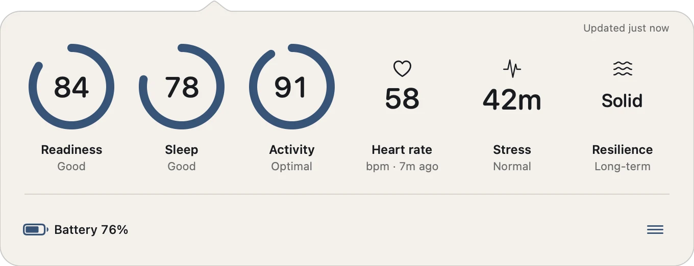
The popover is a single horizontal strip of metric tiles, a slim battery row and a compact options menu. No cards, tabs or headings compete with the numbers. Readiness, Sleep and Activity appear as score rings; Heart rate and Stress are not scores, so they get an icon and a value instead of a fabricated progress ring.
Every normal score shares one signal blue. Giving each metric its own color would have turned a calm status strip into a generic fitness dashboard, so color is saved for the moments that need attention.
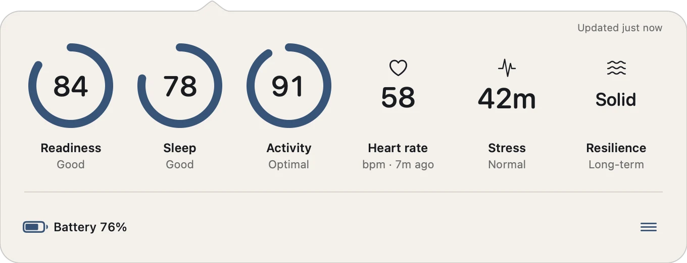
The default theme: warm canvas, dark ink and one signal blue for every score.
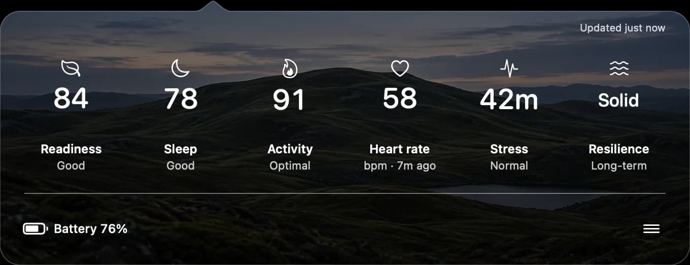
Landscape theme, same moment: icons over an original Nordic photograph. Same labels, same states, same order.
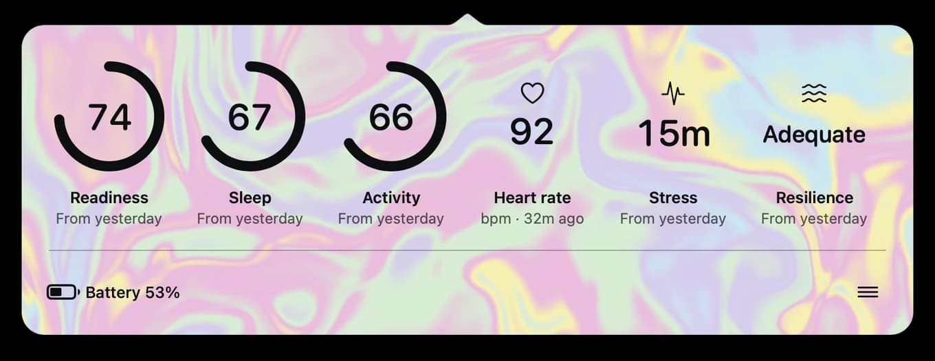
Holographic theme: the marbled finish from the app icon, with dark ink kept for contrast.
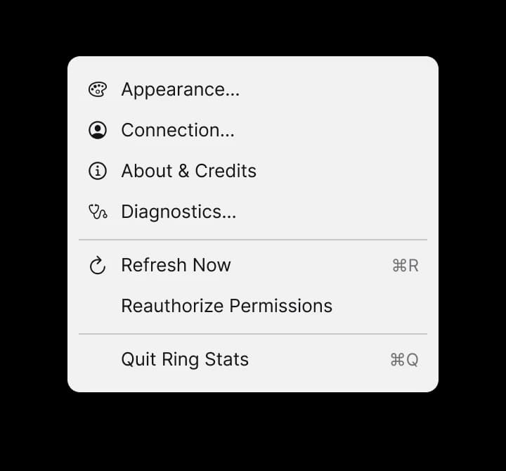
One native menu for everything that is not a stat: settings, refresh, reauthorize and quit.
Design System
The Quiet Signal Strip
A small system with strict rules. Every tile has the same four zones in the same order: an 84-point visual, a value on a shared baseline, a title and one line of detail. Themes and metrics change the content of those zones, never the layout, so a Resilience level and a heart-rate number still line up.
Seven color tokens, three type roles and a four-step spacing scale cover the whole app. Themes change presentation only: a test fails the build if the two themes ever show different lines or labels for the same state.
In Figma, every view carries paired behavior and accessibility notes, so the spec says how each control works and how it is announced, not only how it looks.
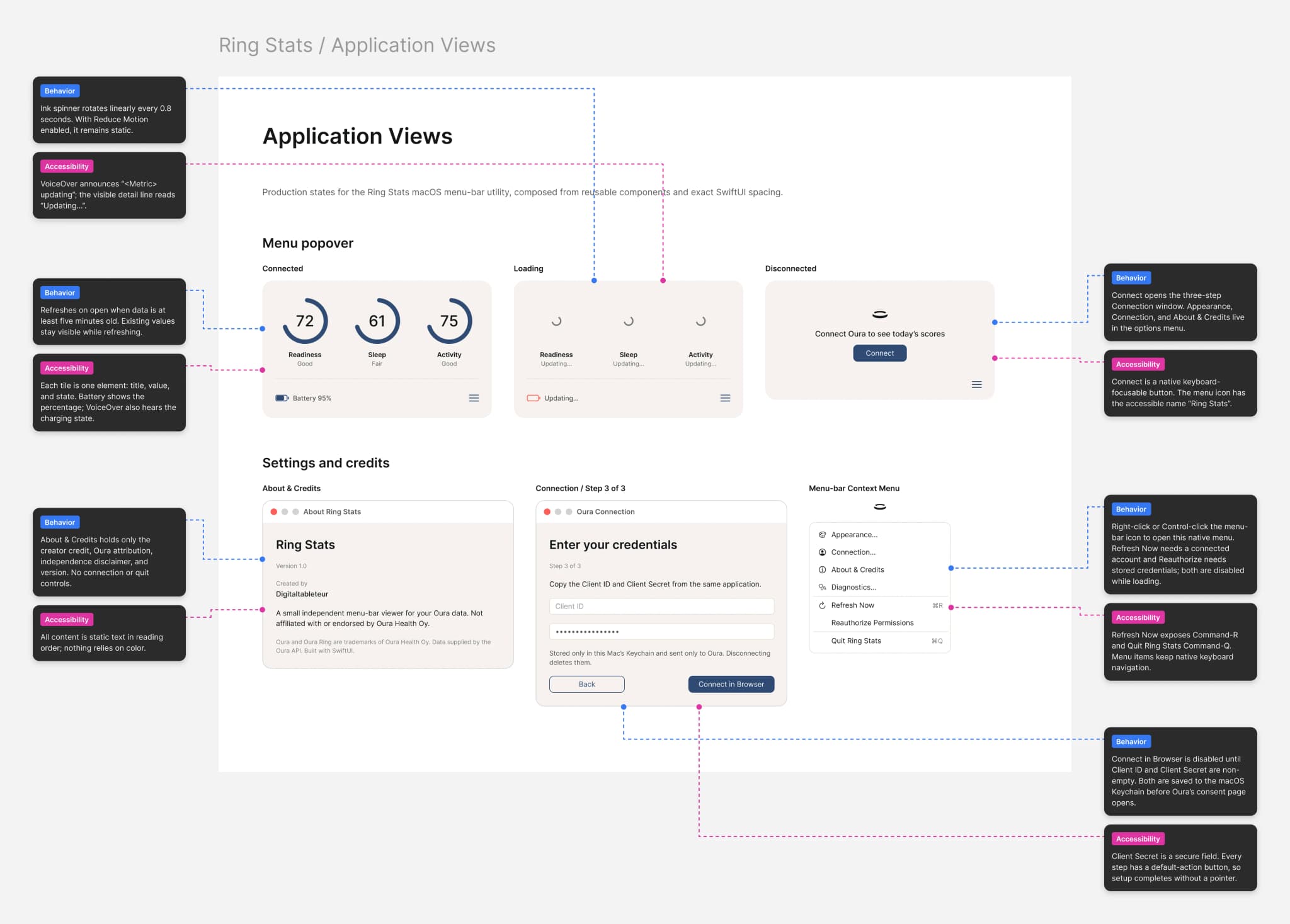
The annotated spec: behavior in blue, accessibility in pink, each pinned to the control it describes.
Decisions
Three Calls That Shaped It
A status strip over a dashboard. Trends, history and recommendations already live in the phone app, where they are done well. Repeating them on the Mac would have made a slower copy of something better. The strip answers one question and gets out of the way.
Your own credentials over a shared secret. Each person registers their own developer application and enters its keys once. It adds a setup step, but no shared secret ships inside the app and no server sits between the ring and the Mac.
Hidden means not fetched. Turning a metric off in Appearance also removes it from the request and from the permissions asked for. Customization is a privacy control, not just a layout preference.
Diagram text alternative
- The ring syncs to the phone app.
- The phone app uploads to the Oura API V2, which returns enabled stats only.
- Ring Stats on the Mac, inside the App Sandbox, fetches those stats and keeps values in memory only.
- Ring Stats stores credentials and tokens in the macOS Keychain.
Honest Freshness
Old Numbers Say They Are Old
A wellness number shown as current when it is hours old is worse than no number at all. So a stat that fails to refresh keeps its last known value, dims and reads “Not updated” in text, not just in color. The status line says when data last arrived, confirms a successful refresh for three seconds and then fades away so the strip stays quiet.
Missing permissions get their own state and a direct fix instead of an endless partial refresh. Every one of these states is rendered by the test suite in both themes and at every supported width, so none of them is designed once and forgotten.
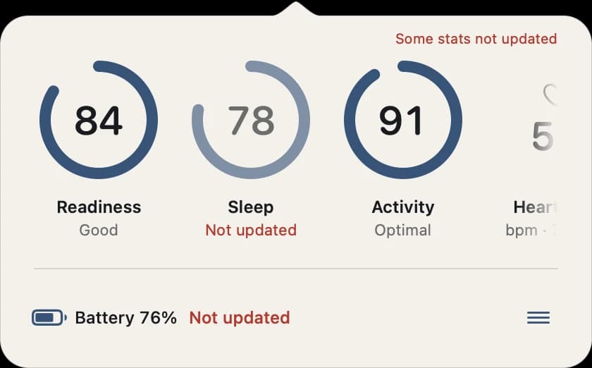
A partial refresh: Sleep and battery keep their last values and say so.
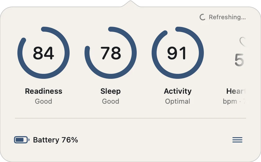
Refreshing, without hiding what is already known.
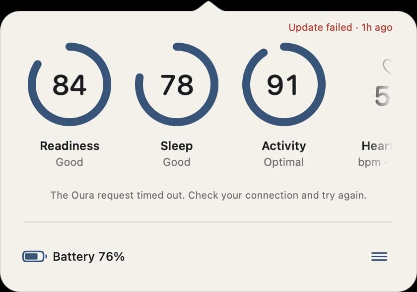
A failed refresh names the cause and the age.
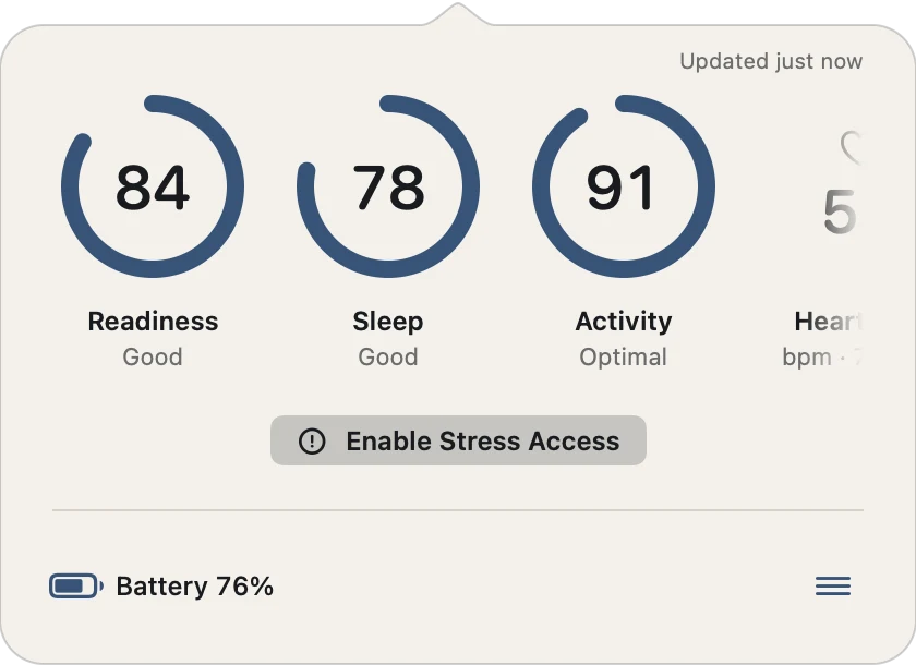
A missing permission comes with its own fix.
Onboarding
Three Steps to Connected Securely
Bring-your-own credentials is the least friendly part of the product, so it got the most design attention. Setup is three steps with a step indicator: create the application and learn why it is needed, add the callback address with a one-click copy, then enter the keys with a plain note that they stay in this Mac's Keychain.
The flow ends on a confirmation rather than a dialog dismissal: “Connected securely”, one sentence on where data lives and a single button that opens the stats.
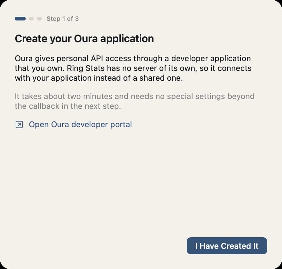
Step 1: why a developer application is needed.
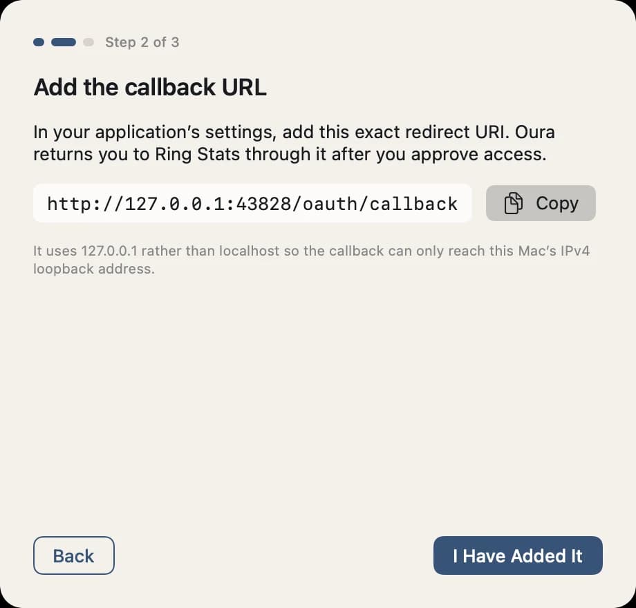
Step 2: one address, one copy button.
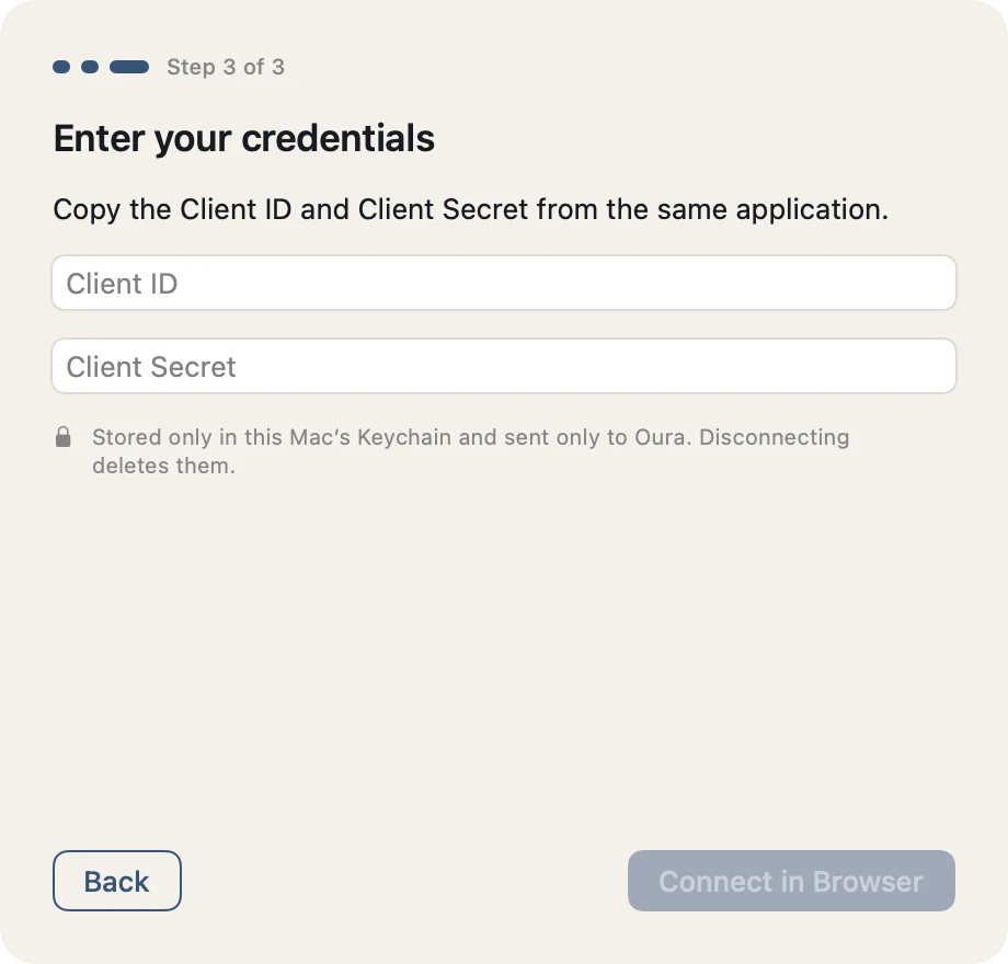
Step 3: keys go straight to the Keychain.
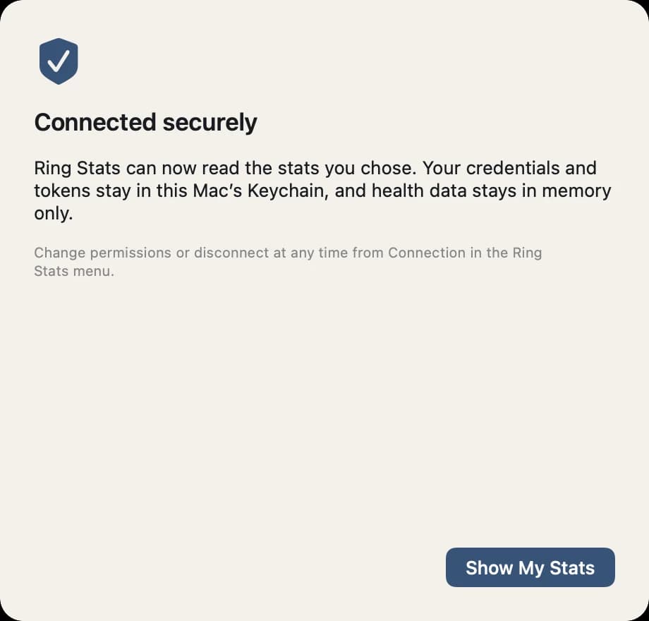
The finish line says where the data lives.
Accessibility
Evidence, not Intent
Accessibility is tracked as a matrix where an item only counts as verified when a test or a dated manual check proves it. Small text meets 4.5:1 in both themes, including over the brightest pixel of the landscape photograph. Two failing tokens were caught this way and fixed before release.
macOS does not apply Dynamic Type to SwiftUI on the Mac, so Ring Stats has its own text size setting that scales type and tile geometry together. The stats row is fully keyboard operable: Tab to reach it, arrow keys to move and Option-arrow to reorder, with each move announced to VoiceOver.
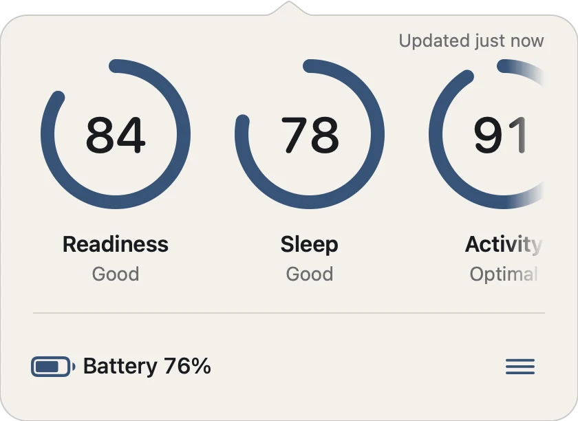
Extra Large at the narrowest width: bigger type, bigger tiles, nothing clipped.
Brand Identity
Respectful of the Ring It Reads
Ring Stats is an independent project, not affiliated with or endorsed by Oura, and the identity makes that clear at a glance: a warm-neutral palette, native system type and icons, and an original mark. No borrowed logo, product silhouette, proprietary fonts or copied app chrome.
The mark is a ring seen at an angle, with a gap where the band turns away. The same mark works as the small icon in the menu bar and as the app icon.

The mark.

The app icon.
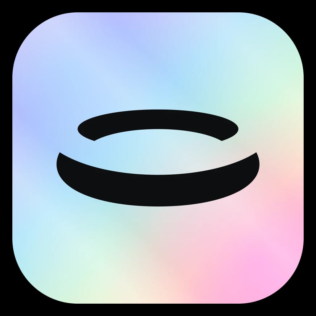
A holographic edition.
Delivery
Signed, Notarized, Sandboxed
Ring Stats ships as a Developer ID-signed, Apple-notarized universal disk image with a published checksum. It runs in the App Sandbox with four entitlements, has no third-party runtime dependencies and no analytics. Releases carry a software bill of materials and a signed provenance attestation.
146 automated tests cover the app, including a state gallery that renders every popover state in both themes and at three widths. Version 1.2 added Shortcuts actions for any stat or the battery, so the numbers also work in automations. Next: a moderated usability study with five to eight ring owners, manual VoiceOver and keyboard verification, and battery-first features such as an optional low-battery notification.
Interested in working together?
Let's discuss how design systems, AI and thoughtful UX can elevate your product.