Home Remote
A native macOS remote for TVs, home AV and audio equipment: local-first control with a design system for a fun clay interface.
Context
One Person, Every Role
A weekend solo project end to end: product design, brand, SwiftUI development and release engineering by one person. The constraints were self-imposed and strict: local-first privacy with no cloud account, vendor protocol quirks handled without vendor apps and a visual system that survives both a Dock window and a menu-bar popover.
The user is whoever is across the room from the screen. The jobs are short and impatient: pause or resume, nudge or mute volume, launch a streaming app, switch inputs, wake or power off and confirm what is actually playing.
The Problem
Many Screens, Many Protocols, One Terminal
Existing desktop controls were fragmented across vendor apps, command-line tools and inconsistent pairing flows. Speed and legibility matter more than exhaustive diagnostics when you are sitting across the room from the screen.
The remote also had to be precise about state: show whether the screen is actually active rather than whether a standby service happens to answer and never imply success after an error.
The Product
One Popover, Three Focused Tabs
The interface fits into a compact 330-point menu-bar popover organized around three tasks: control, device maintenance and preferences. Remote puts availability first, then the control hierarchy: the five-way wheel, playback, volume and verified streaming destinations, all one click deep. Devices handles selection and pairing as an inline maintenance state instead of a separate settings maze. Settings keeps appearance, key clicks and motion preferences on plain rows.
Capability honesty drives the layout: panels omit any state or action the selected device cannot prove. A desktop monitor declares itself a monitor, reports no tuner and refuses to pretend to change channels.
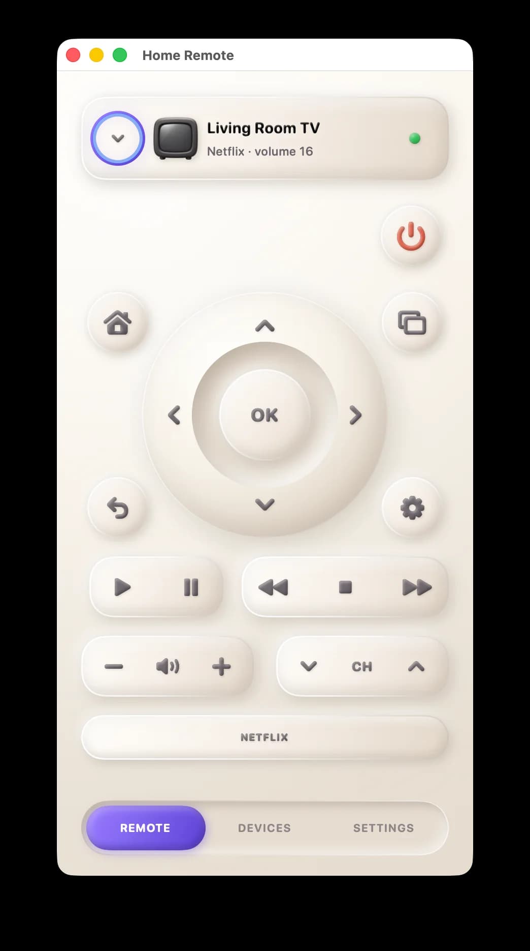
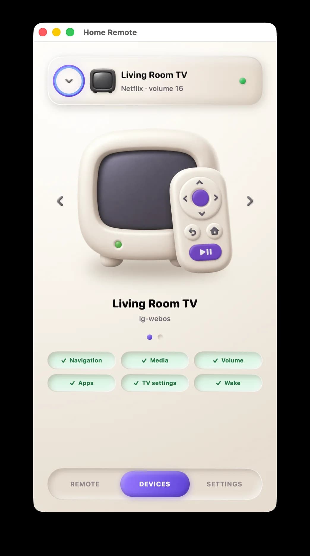
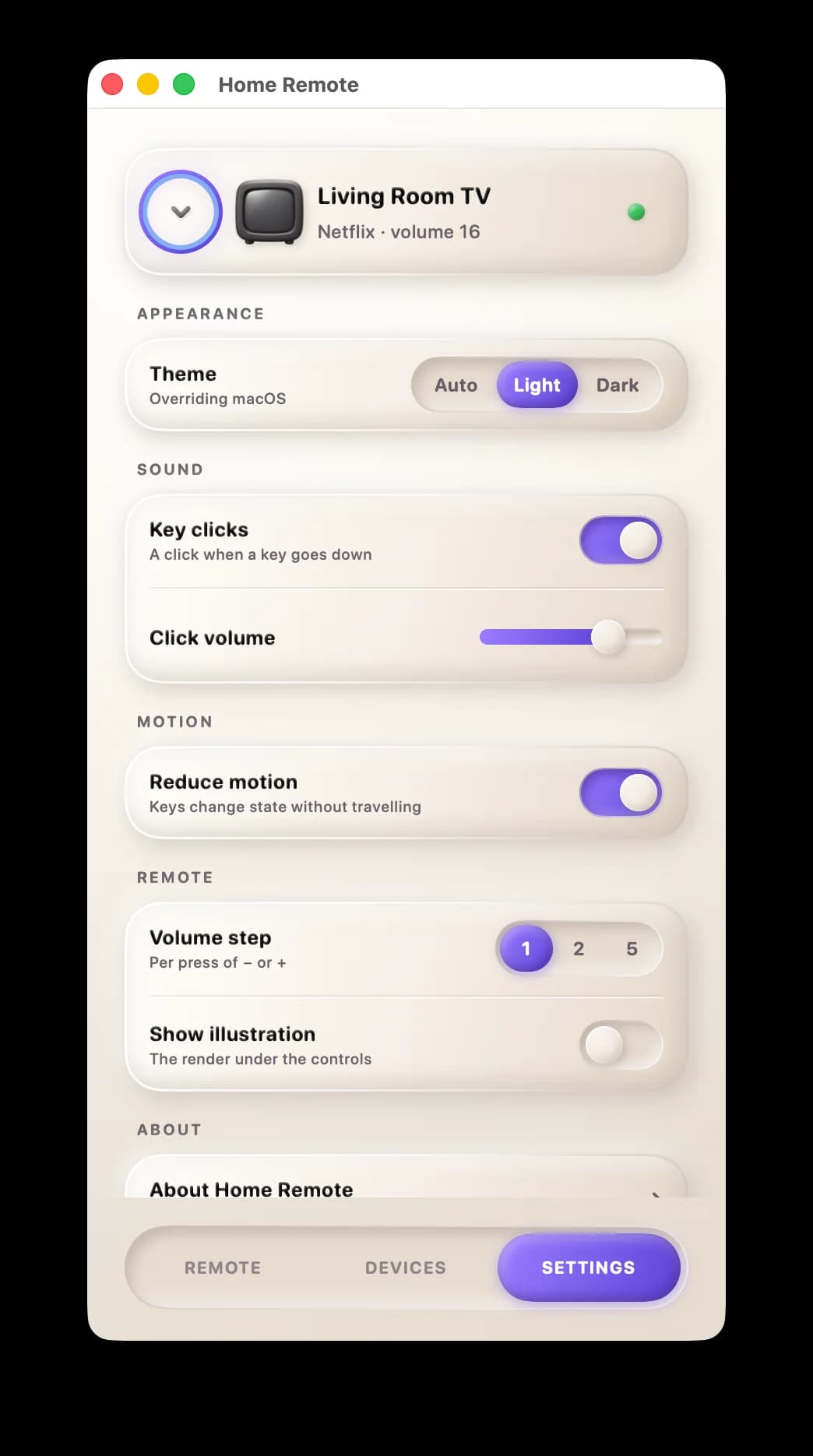
The three tabs: Remote, Devices, Settings. Availability first, pairing as inline maintenance, preferences on plain rows.
Material System
Clay: Raised Means Pressable
The interface is built from a bespoke warm-clay material with named tokens, each carrying a light and a dark value. The relief language does the explaining: embossed surfaces are pressable, debossed surfaces are state and a single light source sits at the top-left of every surface. Blocks sit on one 18-point rhythm.
Availability still reads as green, amber, or red, but never by color alone. Motion is a defined system for press, release, hover and state, and the panel ORs the system Reduce Motion setting with its own preference.
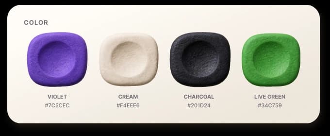
Four example colors from the palette: violet for focus, cream for keys, charcoal for type and live green for online status.
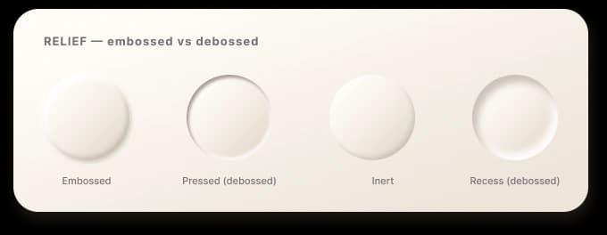
The relief vocabulary: embossed, pressed, inert and recess.
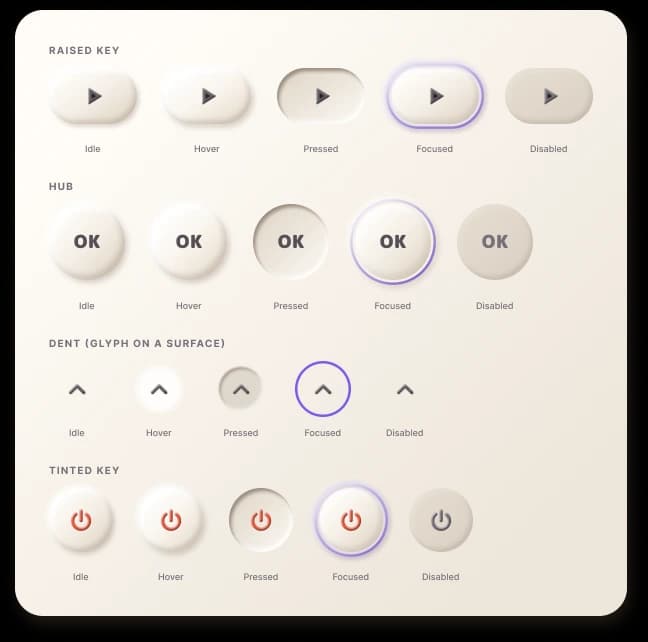
Every key across idle, hover, pressed, focused and disabled.
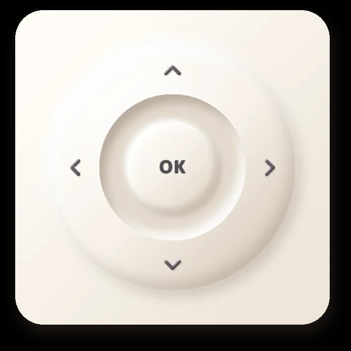
The five-way wheel: one dominant control, sized for hitting without looking. Every other key defers to it.
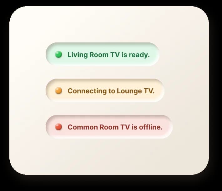
Status is tinted and worded, never color alone; the same rule covers the LEDs and every toast.
Decisions
Three Calls That Shaped It
Thin client over direct connections. The app never touches credentials or sockets; it invokes the CLI against the daemon's restricted API. The rejected alternative, an app that owns its own pairings, would have duplicated trust in two places and made every surface a security boundary.
Capability-honest panels over a universal layout. A control that cannot be proven for the selected device is not rendered. The rejected alternative was the familiar universal remote: one static layout where half the buttons are dead depending on what you point it at.
Clay relief over native flat controls. Standard system controls read poorly from across a room. The relief language makes pressable versus state legible at couch distance, at the cost of maintaining a bespoke material system.
State Before Action
Observed State, Not Assumed State
The status LED next to each device name reports observed state: green when the screen is provably active, amber while something is in flight, red when trust or reachability fails. Pair This TV appears prominently only on an authorization failure; deliberate re-pairing stays tucked in the header menu where it cannot be hit by accident.
The thin client never touches credentials. The app invokes the CLI with a captured device ID and structured arguments; pairing keys live in the macOS Keychain, readable only by the daemon.
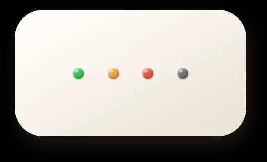
Observed state, at a glance.
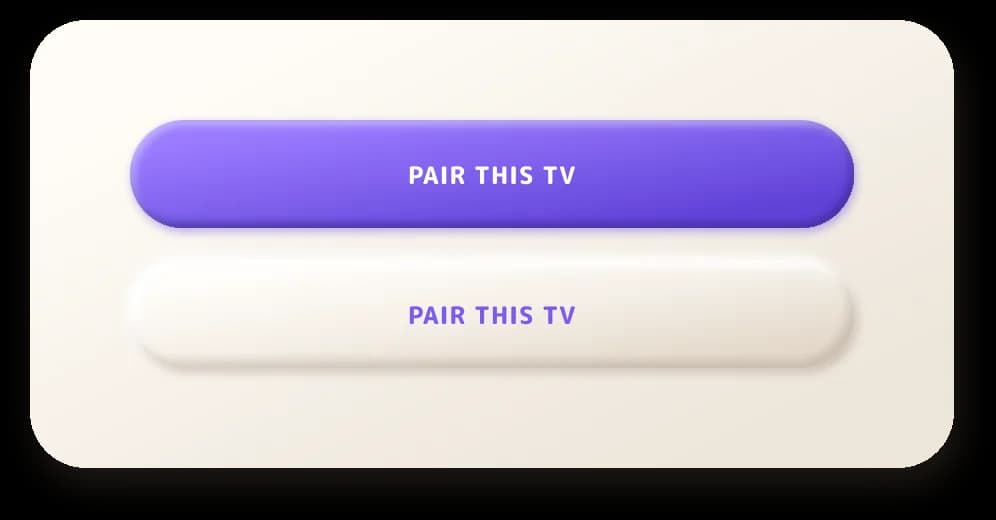
One-click pairing.
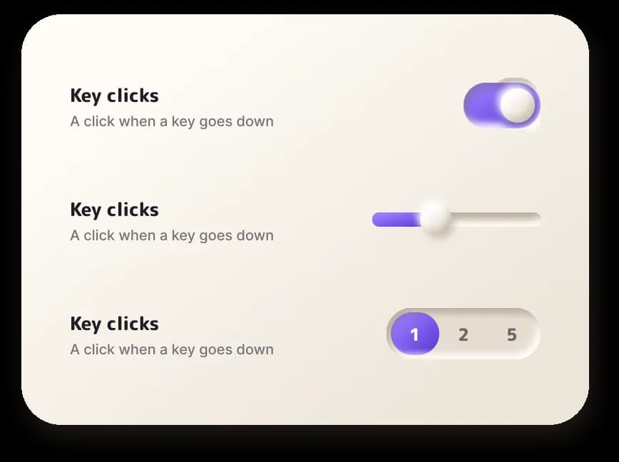
One row grammar for every setting.
Brand Identity
A Remote You Would Leave on the Couch
The identity was explored with AI image generation and refined by hand: a little clay television and its remote, developed through retrospective construction studies, form iterations from angular to soft and material studies that picked the violet accent now running through the app, the icon and the installer as one palette.
The wordmark got the same treatment: clay letters generated in the same material language as the interface, so the brand and the buttons feel like they were fired in the same kiln.
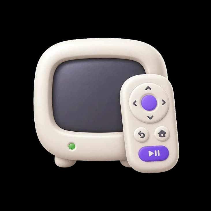
Icon: the whole product in one object.
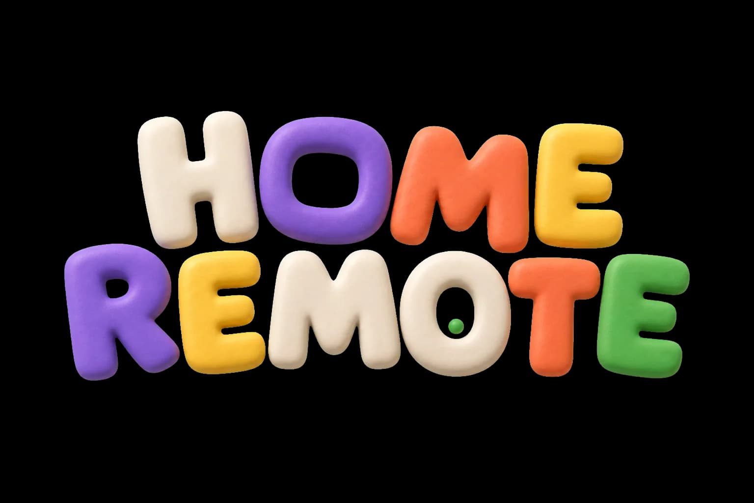
The clay wordmark in the interface palette.
Illustration
Couch Companions
A small illustration series carries the clay world into empty states and the settings pane: someone sinking into an armchair, remote in hand. The X-ray variant is the loading state and it earns its place functionally: it gives the pairing wait a face, makes progress feel shorter than a bare spinner would and keeps the brand present in the app's least glamorous moment.
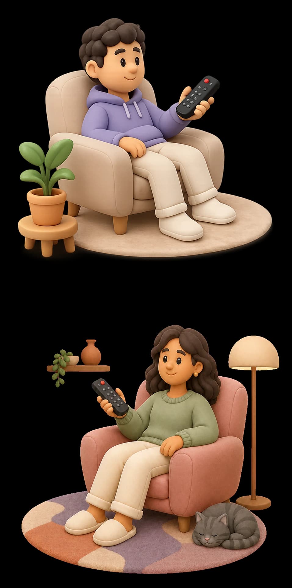
The app clay illustrations.
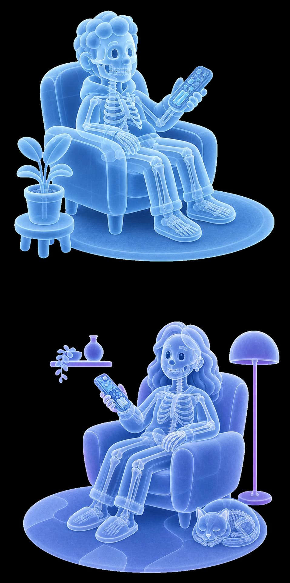
The app clay illustrations for dark mode.

In place, under the controls.
Delivery
Signed, Notarized and DMG'd
Home Remote 0.2.0, a release-candidate build, is a Developer ID-signed, notarized, stapled disk image with a live update feed. The installer carries the same palette as the icon and the app: one violet, three surfaces, no separate marketing skin.
Acceptance is hardware-in-the-loop: a release matrix run in front of both configured displays, covering pairing cycles, cold boots, eight-hour standby checks, a ten-cycle endurance row and network-loss behaviour, retained as sanitized evidence. A transport acknowledgement is never recorded as proof that a panel changed.
Verified so far: two device classes, a television and a desktop monitor, controlled daily. Voice control and the generic remote gateway remain experimental. Next: broaden the verified device matrix and move pairing for more vendors from the terminal into the app.
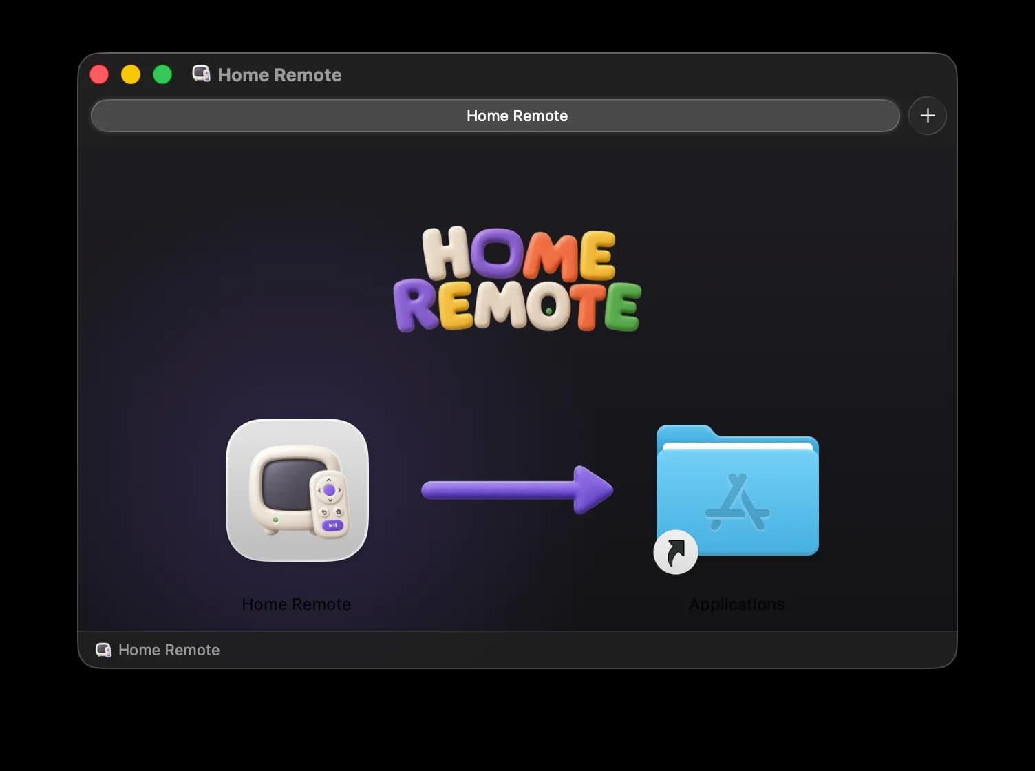
The disk image: installer, icon and app share one palette.
Interested in working together?
Let's discuss how design systems, AI and thoughtful UX can elevate your product.