KnobSmith Audio
Designing frictionless UX for audio plugins, blending analog inspiration with modern interaction patterns.
The Problem
Audio Plugin UX Is Stuck
Many audio plugins still emulate vintage hardware with pixel-perfect recreations of knobs and meters. While visually appealing, these interfaces often sacrifice usability for aesthetics.
KnobSmith focuses on removing friction from everyday workflows by rethinking control affordances, feedback loops, and parameter discoverability.
Exploration of layout, controls, and real-time feedback.
Interaction Design
Precision Controls, Modern Feedback
Interaction patterns prioritize clarity: larger touch targets, explicit value readouts, and smooth animated feedback for every parameter change.
Visual exploration balanced high-fidelity knob rendering with modern typography and grid-based layouts so the interface stays legible in the studio and on the go.
Visual Feedback
Metering That Speaks
Great metering is more than eye candy. It's a real-time conversation between the plugin and the producer. The VU meter design balances analog warmth with pixel-perfect accuracy, providing instant feedback on dynamics without overwhelming the interface.
Needle physics were tuned to feel natural: responsive enough for transients, yet smooth enough to read sustained levels at a glance. The glow and shadow work together to make the meter readable in any lighting condition, from dim studios to bright laptop screens.
VU meter with analog-style needle physics and dark theming.
Brand Presence
Online Identity
A cohesive digital presence extends the plugin's personality across web and mobile. The website balances dark studio aesthetics with clear product information, while the mobile experience keeps producers connected on the go.
Typography, color, and interface patterns remain consistent from desktop to pocket, reinforcing brand recognition whether users are browsing demos or managing licenses.
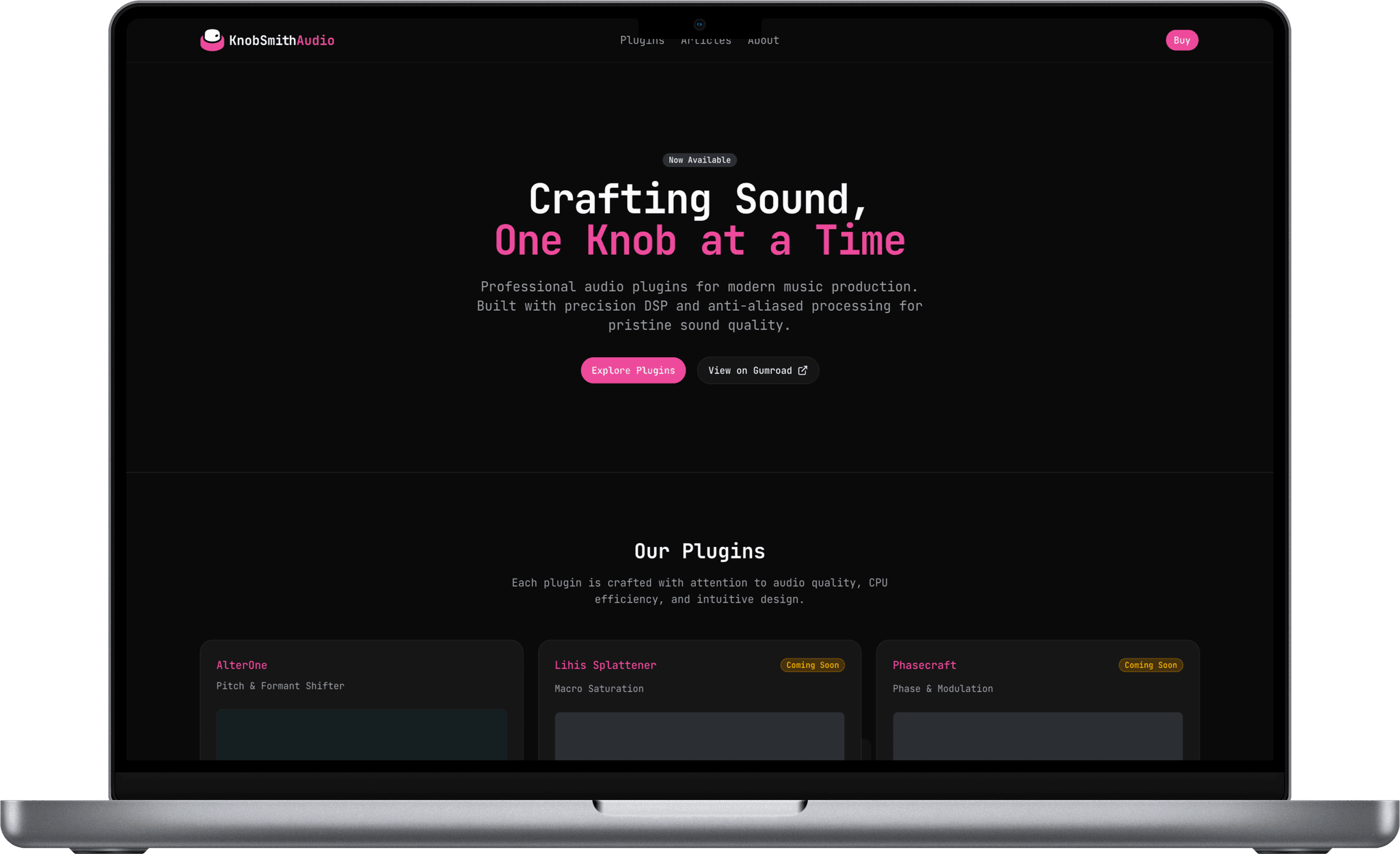
The desktop experience embraces a dark studio aesthetic, reducing eye strain during extended sessions while showcasing the brand's signature pink accents.
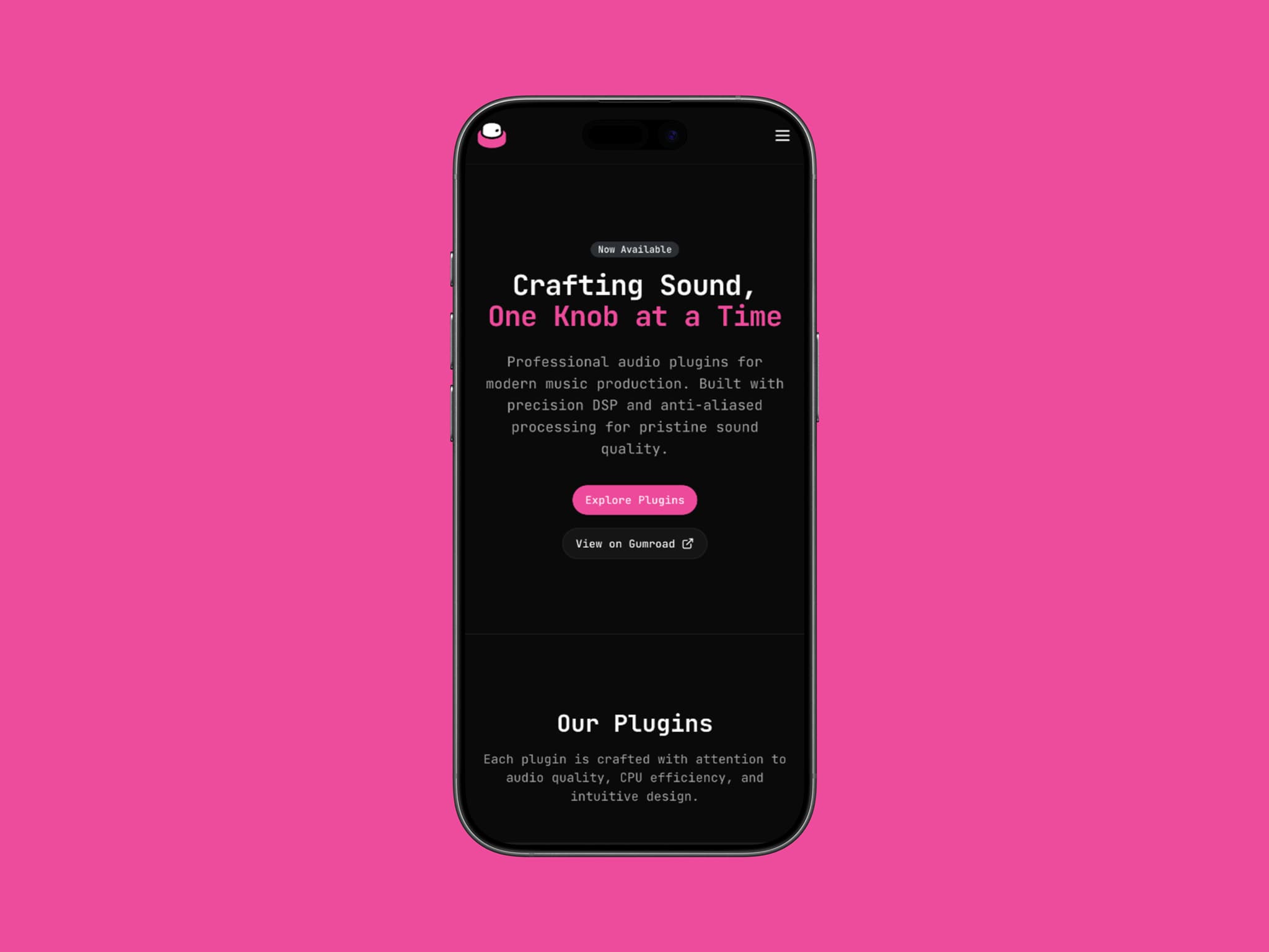
Mobile-first responsive design ensures producers can browse plugins and manage their accounts on the go, with touch-optimized navigation.
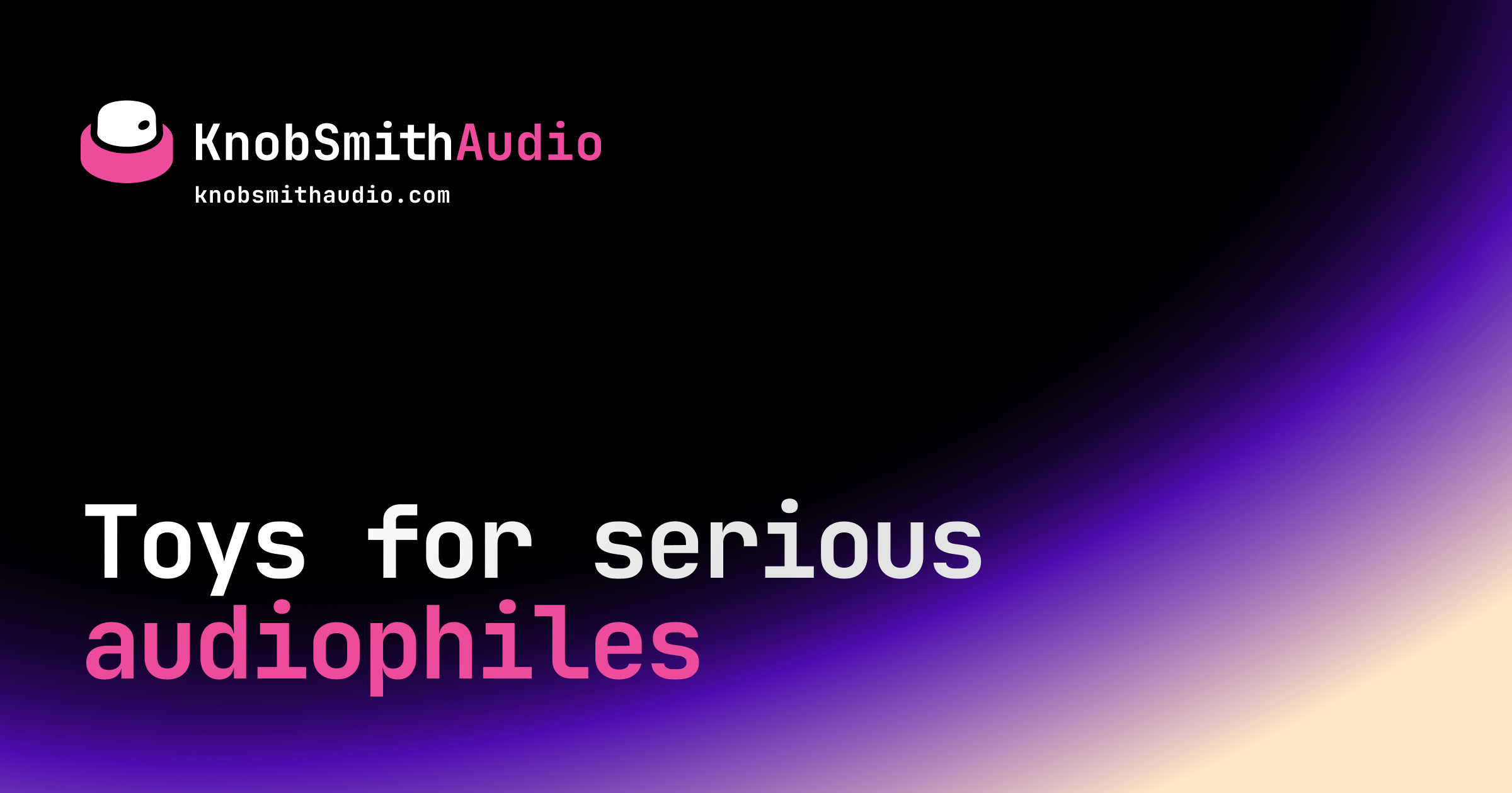
The Open Graph image ensures consistent brand presence when links are shared across social platforms.
Brand Identity
The Mark
The KnobSmith Audio identity centers on a minimal, iconic mark that evokes the tactile rotation of a hardware knob. Paired with a clean wordmark, it scales from plugin splash screens to social avatars.
The animated reveal sequence adds a premium touch to loading states and first impressions. Mechanical yet refined, like the tools themselves.
The complete KnobSmith Audio lockup: logo paired with wordmark.


Some animated logo reveals: icon emerges first, wordmark follows.
Logo Construction
Building the Mark
The KnobSmith Audio logomark is constructed from three concentric ellipses that form the foundation of the knob silhouette. These geometric guides establish the proportions before the final mark emerges with its distinctive rotary control detail.
Brand Identity
Logo Variations
The identity adapts to different contexts with two primary color treatments. The white-on-dark variant dominates the plugin UI and studio environments, where low-contrast visuals reduce eye strain during long sessions.
The pink-on-white inversion brings energy to marketing materials, social media, and lighter web contexts, ensuring the brand stands out whether it's embedded in a DAW or scrolling through a feed.
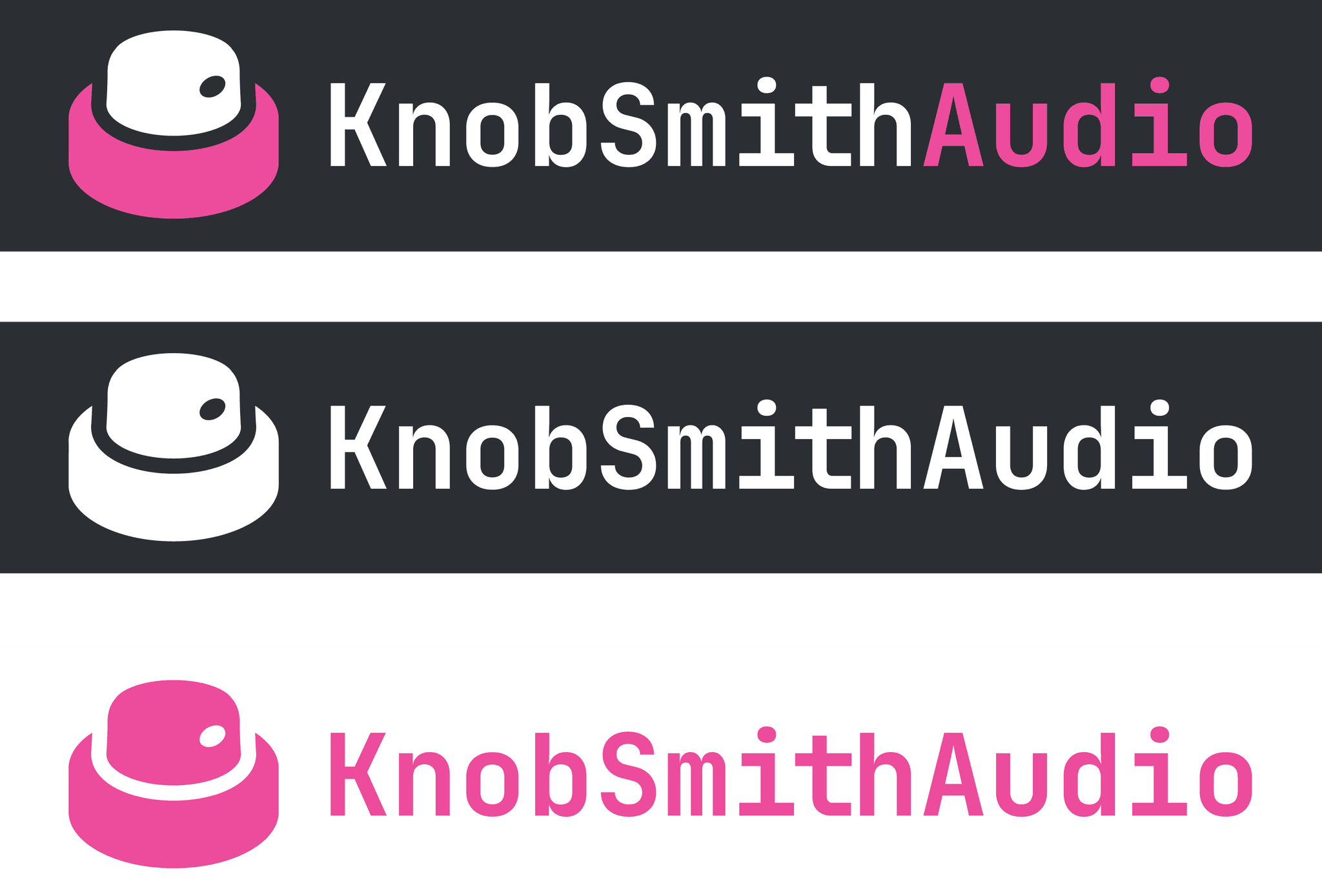
Color variations: white on dark for plugin UI, pink on white for marketing.
Brand Identity
Color Palette
The KnobSmith Audio color palette is intentionally minimal, focusing on three core colors that create maximum impact with restraint. Each color serves a specific functional purpose across the brand system.
The brand's primary accent. Use for interactive elements, CTAs, key highlights, and anywhere the brand needs to assert itself. Energetic and unmistakable.
The foundation color for plugin interfaces and dark UI. Use for backgrounds, body text on light surfaces, and anywhere stability and focus are paramount.
The breathing room. Use for light backgrounds, text on dark surfaces, and negative space. Creates contrast and clarity without competing for attention.
Typography
JetBrains Mono
The brand typography uses JetBrains Mono, a developer-focused monospace typeface that bridges the gap between technical precision and creative expression. Its clean geometry and excellent legibility at all sizes make it ideal for both UI labels and marketing headlines.
Paired with the signature pink (#ED4B9B), the type system creates a distinctive voice that feels both technical and approachable.
Typography
Geist Mono
Geist Mono offers a contemporary alternative with its clean, geometric forms and excellent screen rendering. Developed by Vercel, it brings a modern sensibility that complements the technical aesthetic of audio software.
Its slightly wider letterforms and balanced proportions make it particularly readable for longer text blocks while maintaining the precision expected from a monospace typeface.
Interested in working together?
Let's discuss how design systems, AI and thoughtful UX can elevate your product.