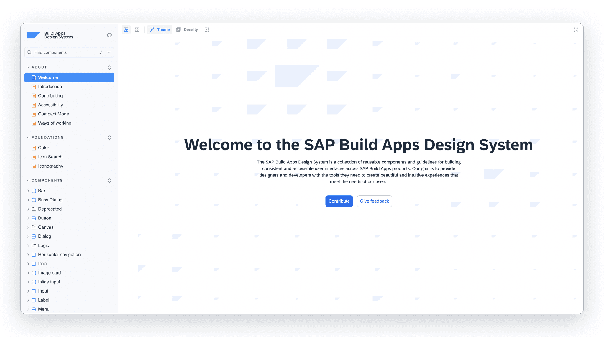
SAP Build Apps Design System
A comprehensive design system powering SAP Build Apps, SAP's flagship low-code platform (formerly AppGyver). Serving 300+ developers and designers who build consistent, accessible enterprise applications with a unified component library spanning Figma and ReactTS.
Services
- Design System Architecture
- Component Design
- Documentation
- Design-to-Code Translation
Duration
March 2022 – February 2026
Tools
Overview
SAP Build Appsis SAP's flagship low-code platform, evolved from AppGyver following its 2021 acquisition. It enables business users and developers to create enterprise-grade applications with drag-and-drop UI, 400+ formula functions, and deep SAP BTP integration.
The challenge: Create a unified design language that bridges the gap between design and development, enabling seamless handoff and consistent implementation across a distributed team serving 300+ developers and designers building applications for the platform used by enterprises worldwide.
Team

Petri Lahdelma
Design System Lead

Hristo Meshinski
Lead Developer

Pekka Turtola
Senior Developer

Vili Karilas
Developer
Process
Discovery & Audit
- Component inventory
- Pattern documentation
- Stakeholder interviews
- Accessibility audit
System Architecture
- Token structure design
- Component hierarchy
- Naming conventions
- Workflow definition
Component Design
- Core components
- Variant systems
- State documentation
- Responsive patterns
Implementation
- ReactTS components
- Storybook documentation
- Contribution guidelines
- Quality assurance
The Challenge
Scaling Design Consistency
Serving 300+ developers and designers working across multiple teams and time zones, maintaining visual consistency was becoming increasingly difficult. Components were being recreated with slight variations, leading to fragmented user experiences across a platform serving enterprise customers globally.
The existing design files were scattered and lacked clear documentation, making onboarding new team members a time-consuming process. As enterprise adoption of low-code platforms accelerated, the platform needed a robust design foundation to scale.
Approach
Centralized Component Lifecycle
We established the Design System Guild, a cross-functional team responsible for maintaining and evolving the design system. This included designers, developers, and product managers who met bi-weekly to review proposals and prioritize work.
Every component followed a defined lifecycle: from initial proposal through design exploration, development implementation, documentation, and finally release with proper versioning.
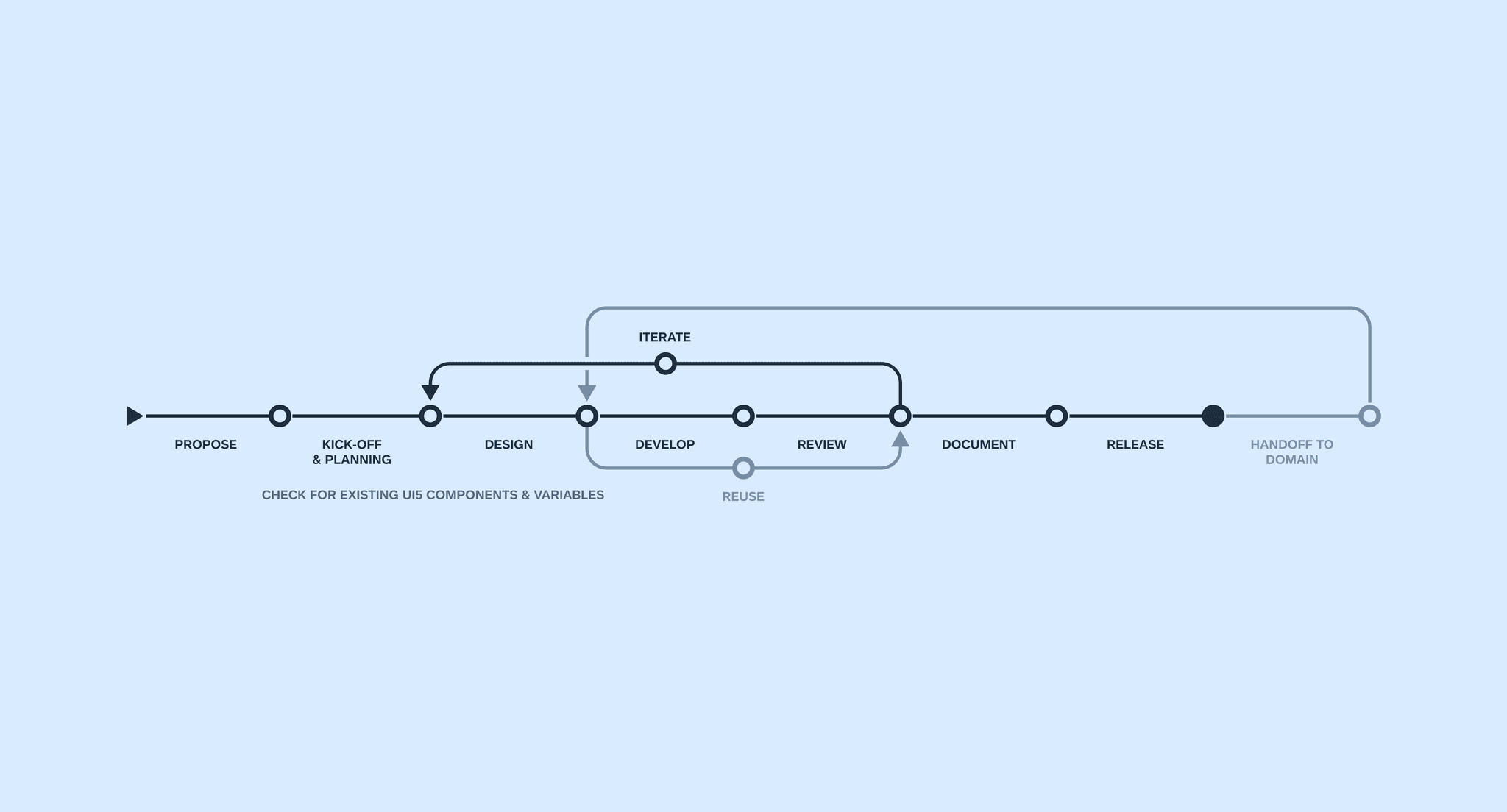
Component lifecycle: proposal - design - development - documentation - release
Foundation
Design Tokens & Visual Language
The foundation of the system was built on design tokens as a shared language between design and code. Colors, spacing, typography, and other visual properties were defined once and consumed by both Figma and ReactTS, ensuring seamless integration with SAP BTP and compatibility with SAP's enterprise ecosystem.
The SAP Horizon theme provided the base color system, with semantic tokens for consistent theming across light and dark modes. Typography followed a modular scale optimized for enterprise applications.
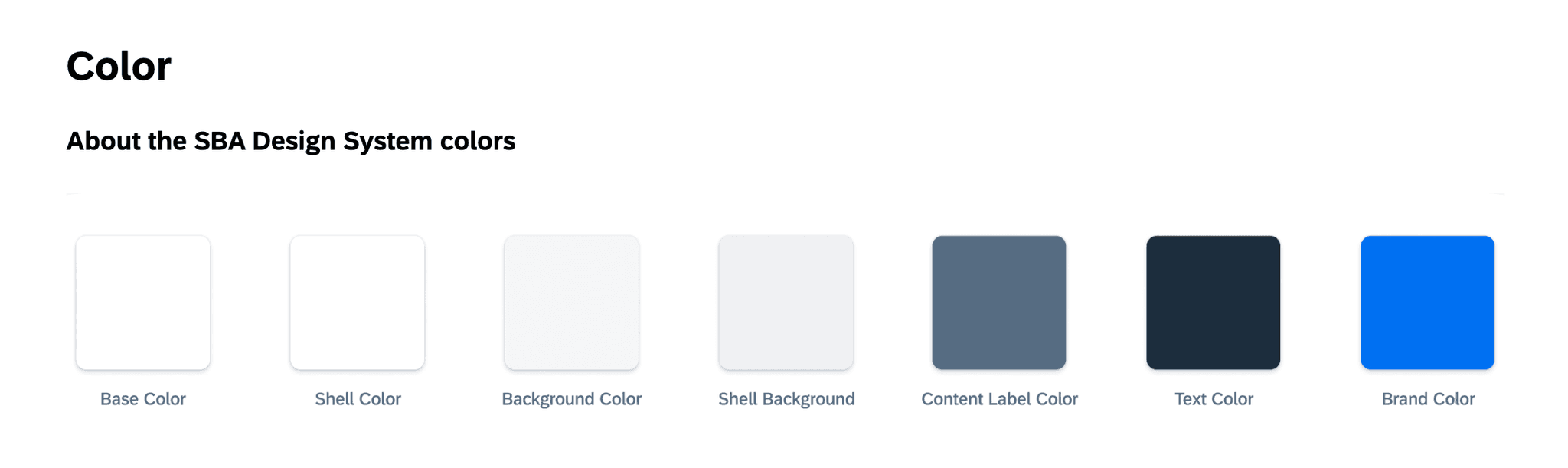
Semantic color tokens based on SAP Horizon theme
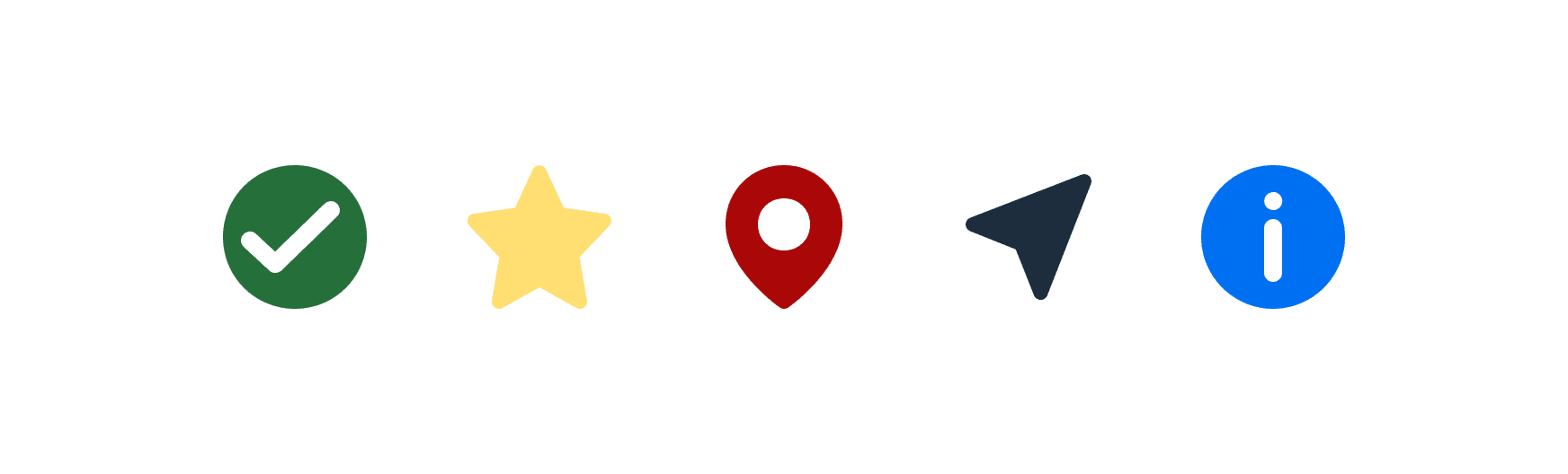
Unified iconography across the platform
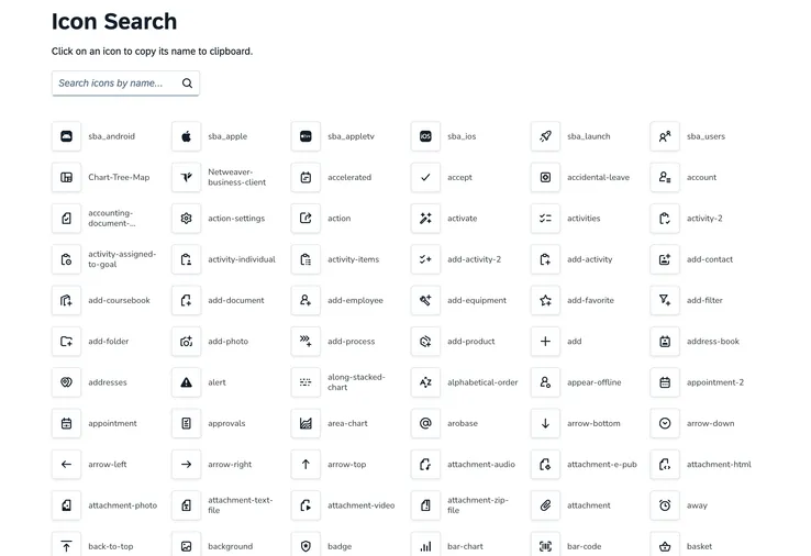
Icon component with search functionality

Modular typography scale optimized for enterprise applications
Components
Building the Library
Core components were designed with accessibility-first principles. Each component included comprehensive states, variants, and detailed documentation of behavior patterns, all WCAG 2.1 AA compliant with keyboard navigation and screen reader support.
The button system alone covered primary, secondary, ghost, and destructive variants, each with hover, active, focus, and disabled states across multiple sizes. The library grew to 100+ components covering form controls, data display, navigation, and feedback patterns.
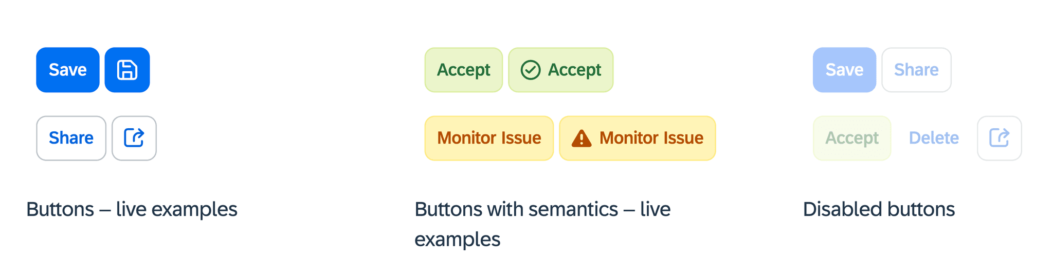
Button system with all variants and interaction states

Semantic message variants with form integration
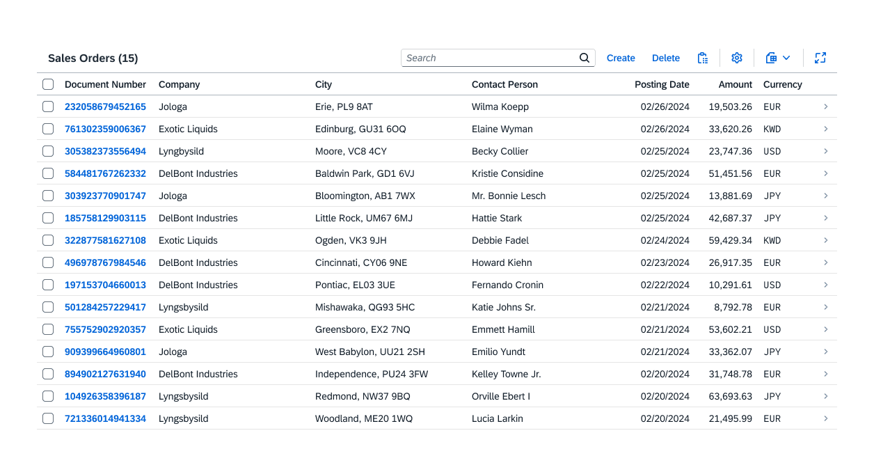
Table component with hundreds of features and addons
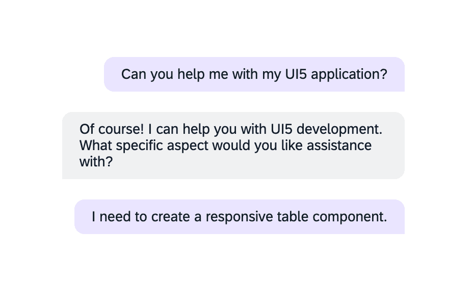
Chat bubble component for AI-powered interactions
Data Components
Tables & Data Visualization
I led the design and specification of a comprehensive table component supporting sorting, filtering, pagination, row selection, and column configuration. Optimized for large enterprise datasets with thousands of rows, the table includes full keyboard navigation and screen reader support, built for seamless integration with SAP data sources including S/4HANA and OData services.
Data visualization components for analytics dashboards included bar, line, pie, donut, and area chart variants. All charts were designed to be responsive and accessible with proper color contrast and pattern alternatives for colorblind users, consistent with SAP Horizon theme tokens.
Data table component for enterprise data display
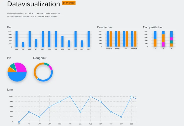
Data visualization components for analytics integration
Enterprise Ready
SAP BTP Integration
Deployment on SAP Business Technology Platform (BTP) required components optimized for enterprise-grade performance. The design system integrated with SAP backend services including S/4HANA, SuccessFactors, and third-party systems via REST and OData, supporting real-time data flows common in low-code applications.
Each component was built to handle large datasets while maintaining performance and accessibility, ensuring consistent user experiences across the diverse applications built with SAP Build Apps.
100+ Components
Comprehensive library covering form controls, data display, navigation, feedback, and layout patterns.
300+ Served
Design system serving 300+ developers and designers building enterprise applications worldwide.
Design-to-Code Parity
1:1 mapping between Figma components and ReactTS implementations with shared tokens.
Accessibility First
WCAG 2.1 AA compliant components with keyboard navigation and screen reader support.
Results
Impact & Outcomes
Over nearly four years, the design system transformed how the team builds UI from fragmented component recreation to a unified library with 100+ production-ready components. Design-to-development handoff improved through 1:1 Figma-to-code parity and comprehensive Storybook documentation.
The unified system continues to evolve with SAP Build Apps. The design system serves as the foundation for the platform's UI, maintained through a structured component lifecycle and regular releases.
Interested in working together?
Let's discuss how design systems, AI and thoughtful UX can elevate your product.