Finnish Transport Agency
Identity system for the merged Finnish Transport Agency, built for multilingual public services and national infrastructure.
Team
 Petri LahdelmaDesigner
 Antti KivinenDesigner
 Yosi BercovichDesigner
Process
Discovery & Research
- Stakeholder interviews
- Legacy brand audit
- Competitor analysis
- Multilingual requirements
Concept Development
- Name exploration
- Visual metaphors
- Wordmark sketches
- Color studies
Identity Design
- Logo refinement
- Typography selection
- Color system
- Language lockups
Guidelines & Rollout
- Brand guidelines
- Stationery design
- Signage templates
- Asset delivery
Concept
The Conductor of Finland's Transport
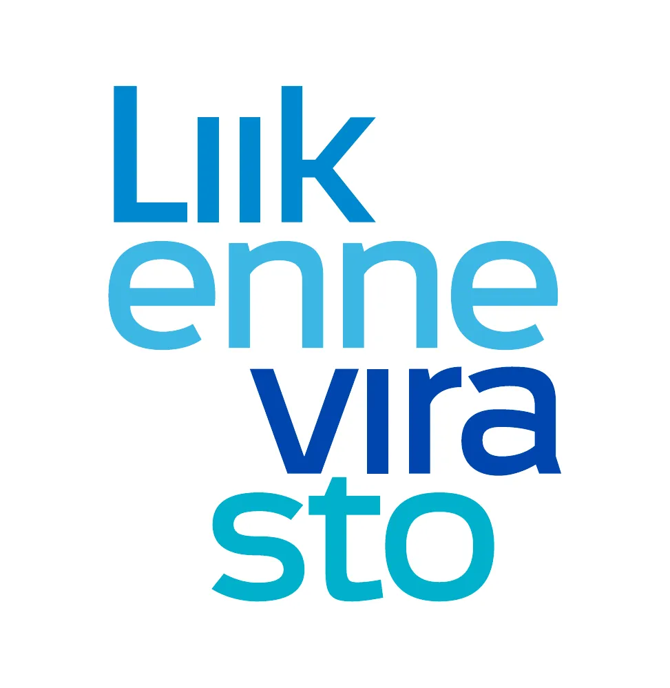
The logo structure is a graphic interpretation of a polyphonic musical score, positioning Liikennevirasto as the conductor orchestrating Finland's roads, rails, and waterways. The cascading word parts create a unique, human-friendly wordmark that signals a fresh start for the merged organization.
Unlike traditional government marks, the moving letters invite a second look. Staff and citizens get a memorable symbol that challenges expectations of what a transport agency can be.
Multilingual
Language Lockups
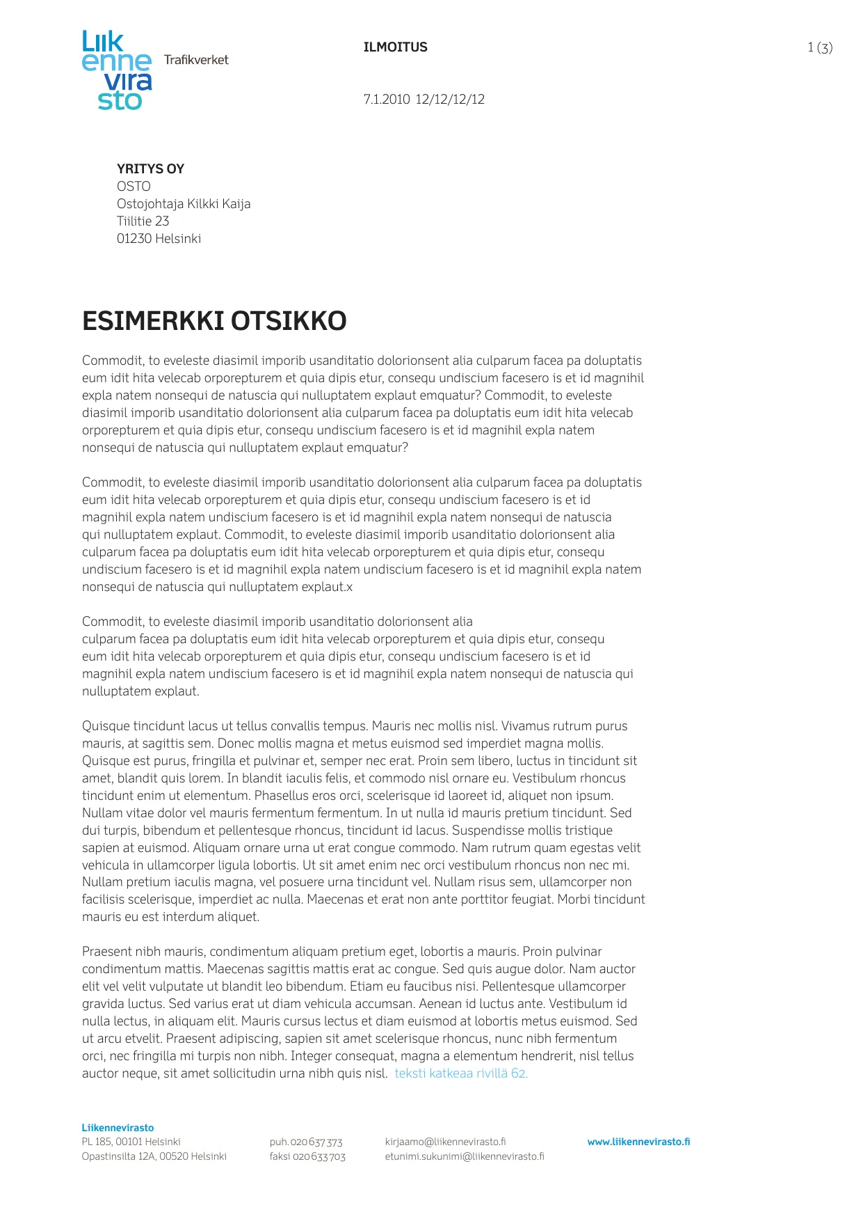
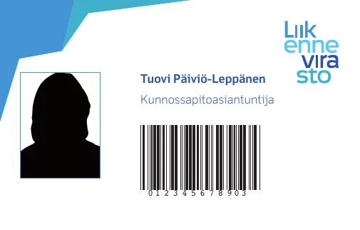
The identity supports three official languages: Finnish (Liikennevirasto), Swedish (Trafikverket), and English (Finnish Transport Agency). Each lockup maintains the cascading wordmark with language descriptors in horizontal or vertical arrangements.
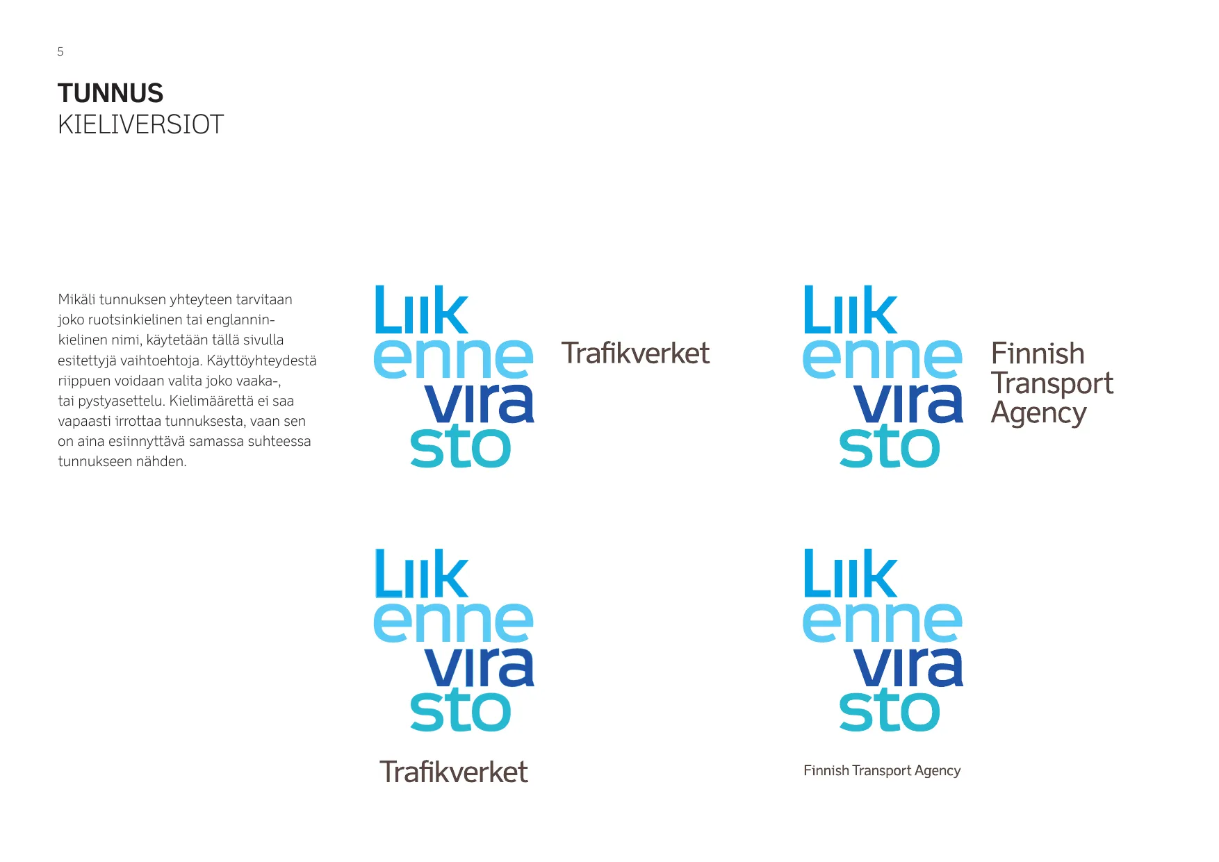
Language variants with locked descriptors for official documents
Construction
Minimum Clear Space
The protection zone is defined by the height of the lowercase "i" as the base unit (x). A minimum of 5x clear space above and x on each side ensures the mark breathes across all applications, from business cards to highway signage.
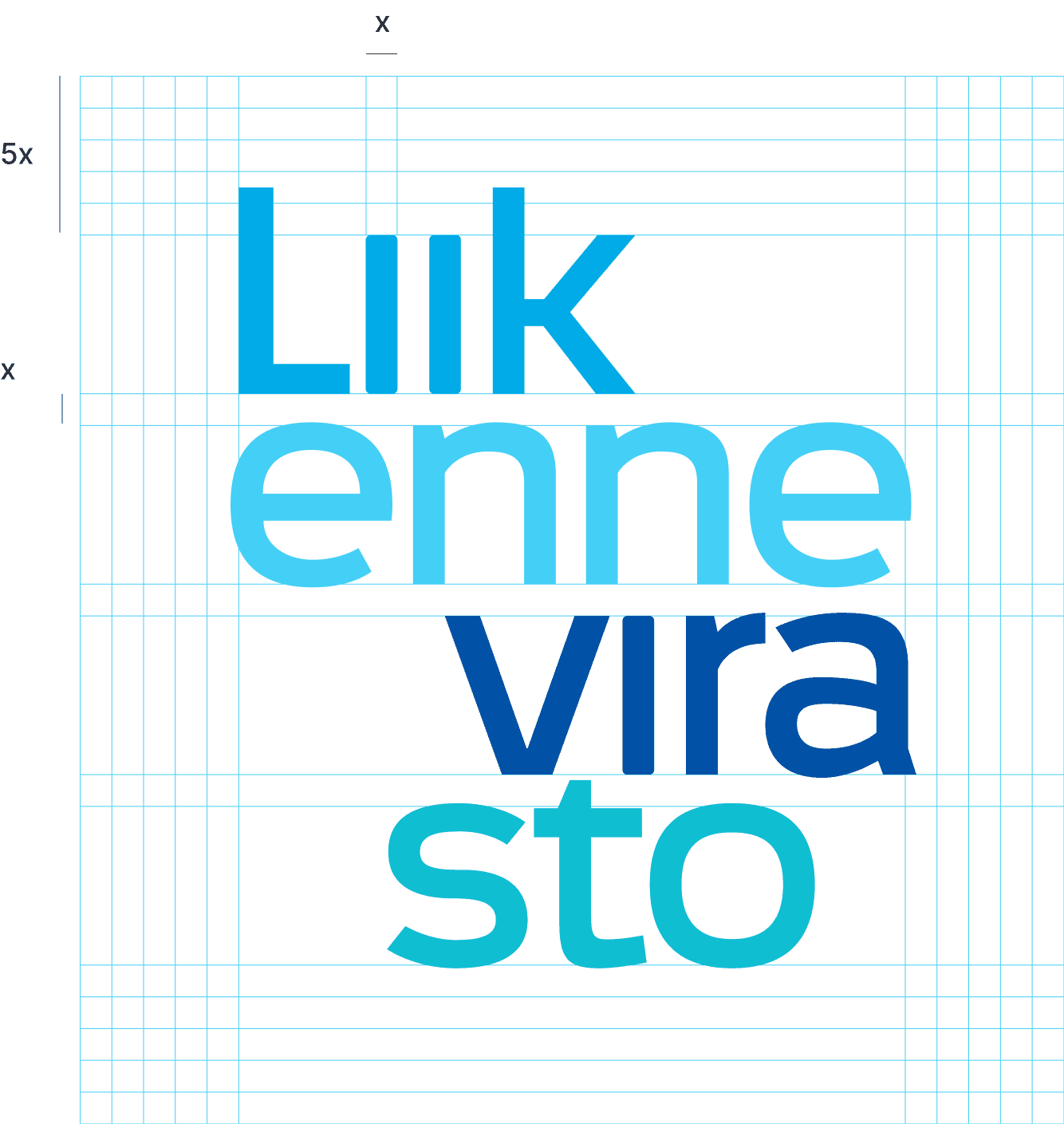
Clear space defined by x-height of lowercase i
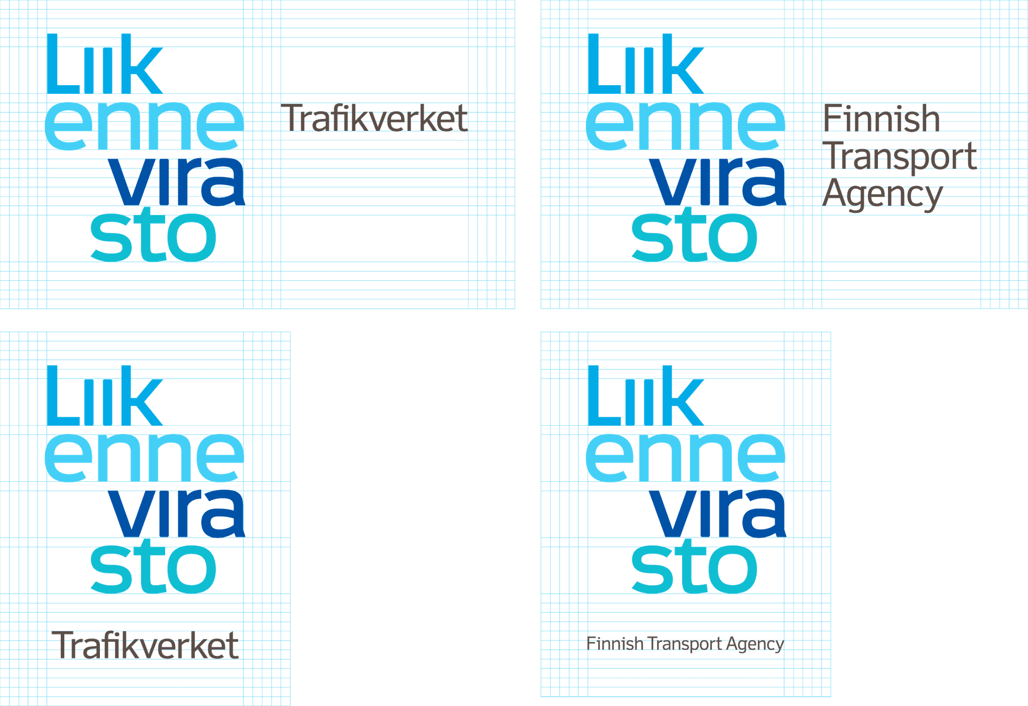
Clear space applied to language lockups
Guidelines
Usage Rules
Five basic rules govern logo usage: always use official files, never modify element relationships, never alter colors, respect protection zones, and avoid adding effects like drop shadows or gradients. The guidelines show approved applications on various backgrounds.
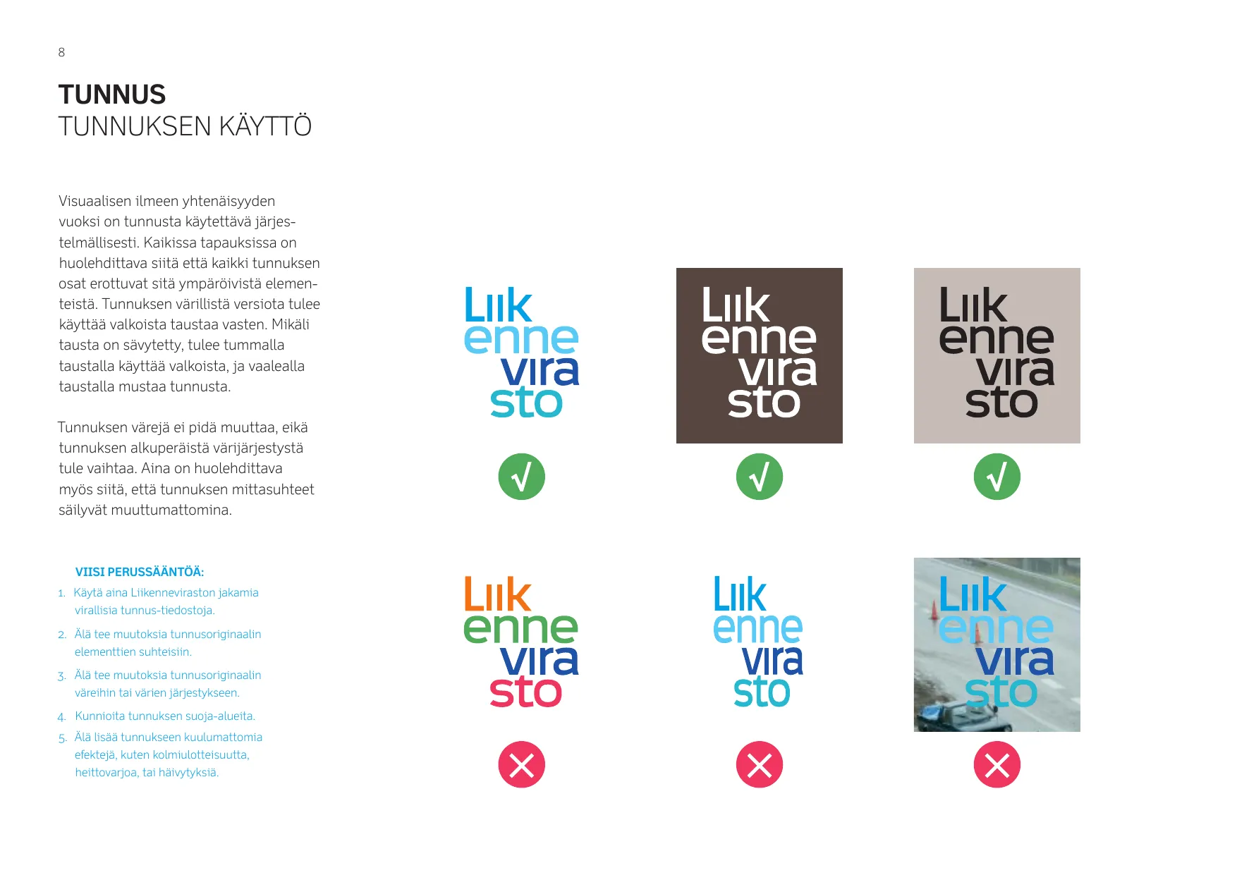
Approved usage on white, tinted, and photographic backgrounds
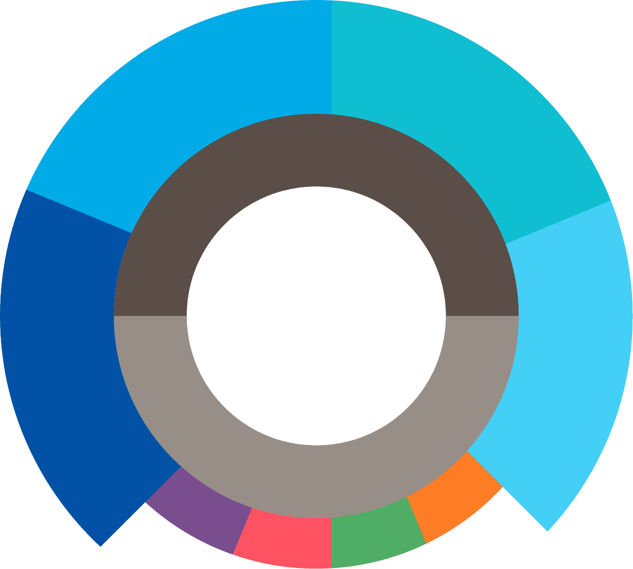
Color System
Four primary blues form the wordmark, supported by warm grays and accent colors. The palette was specified for Pantone (print), CMYK (process), and RGB (screen) to ensure consistency across all media.
Primary
Neutrals
Accents
Color Proportions
The donut chart shows recommended color relationships. Primary blues dominate applications, with neutrals and accents used sparingly to maintain the identity's cohesion across all touchpoints.
Typography
The identity uses Agfa Monotype Felbridge Pro, designed by Robin Nicholas in 2003 specifically for electronic display. Its letter shapes reproduce clearly at low resolutions while maintaining elegance in print.
Specimen rendered in Felbridge Pro, designed by Robin Nicholas for Agfa Monotype.
Official Seals
Stamp Logos
For official documents and certificates, circular stamp variations combine the wordmark with trilingual descriptors. Different center treatments (open, filled, arrow, striped) allow hierarchical distinction between document types.
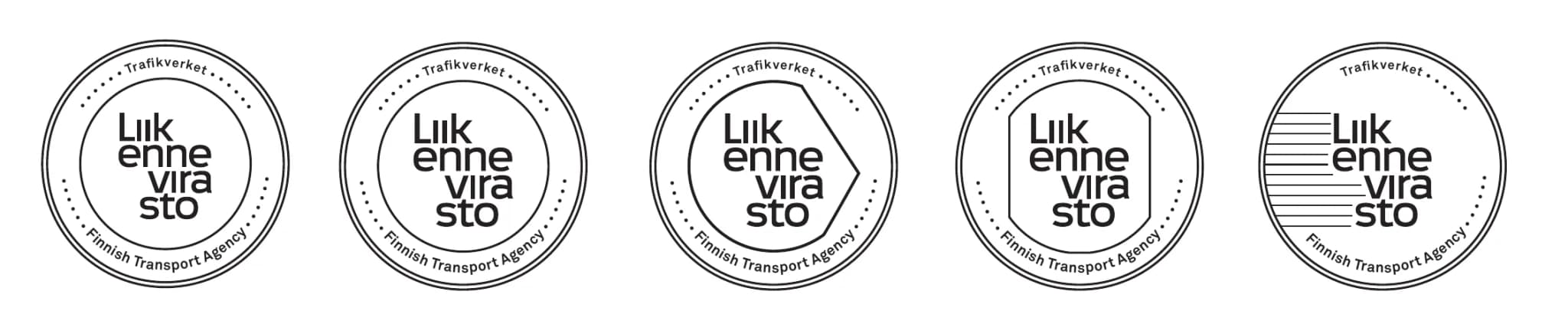
Stamp variations for certificates, approvals, and official seals
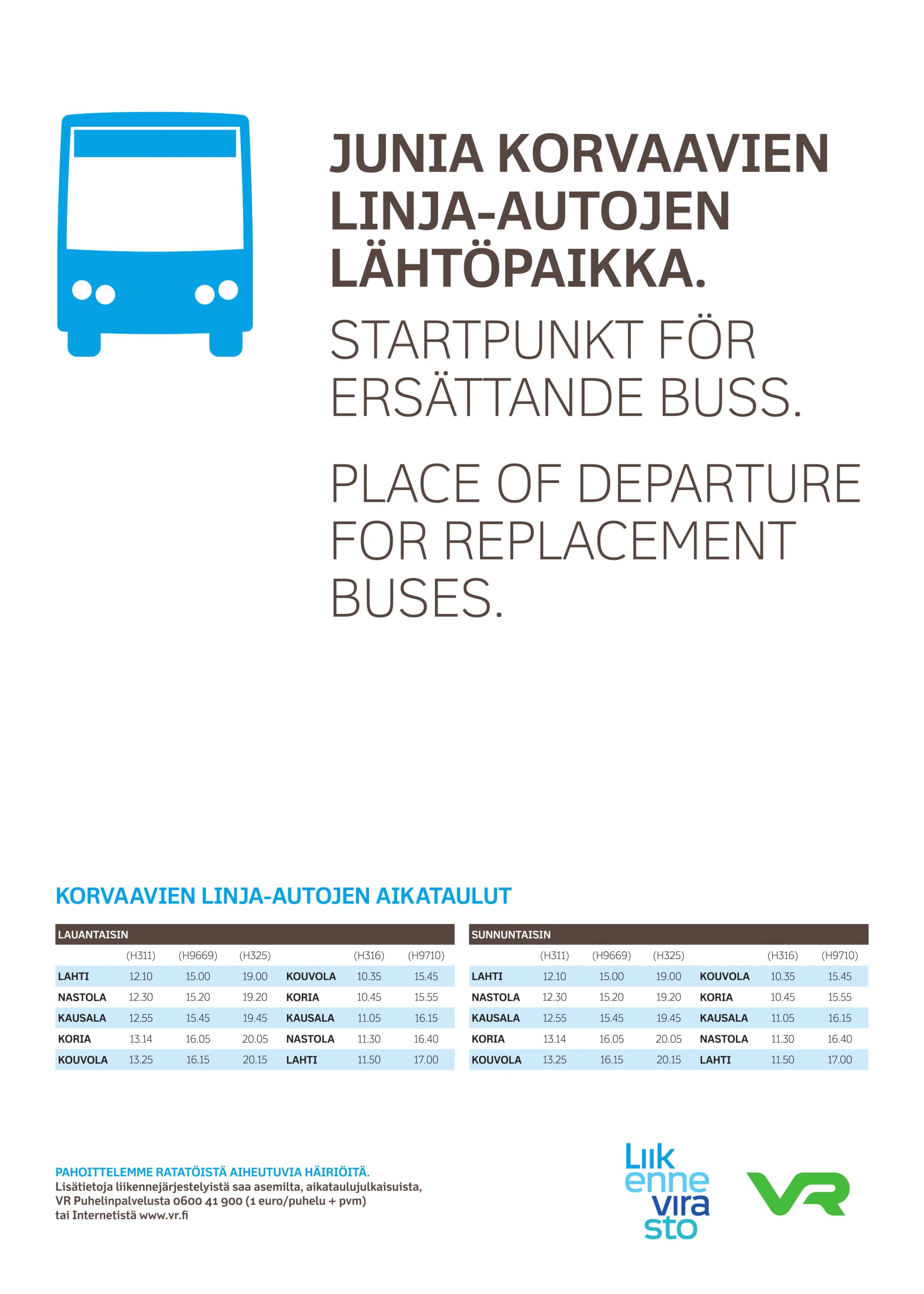
Applications
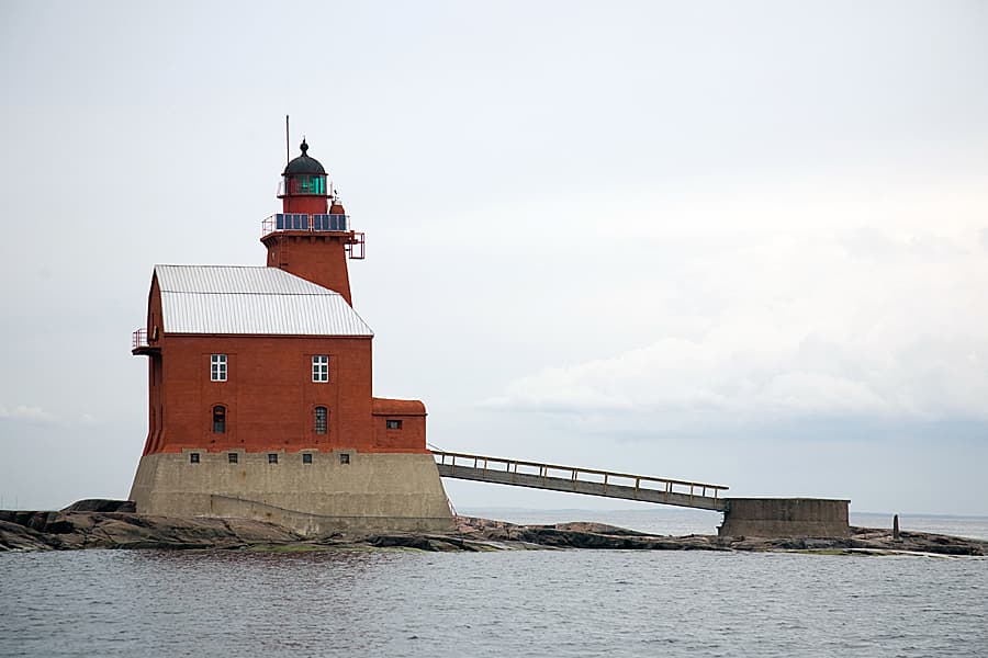
Porkkala lighthouse, one of many coastal assets
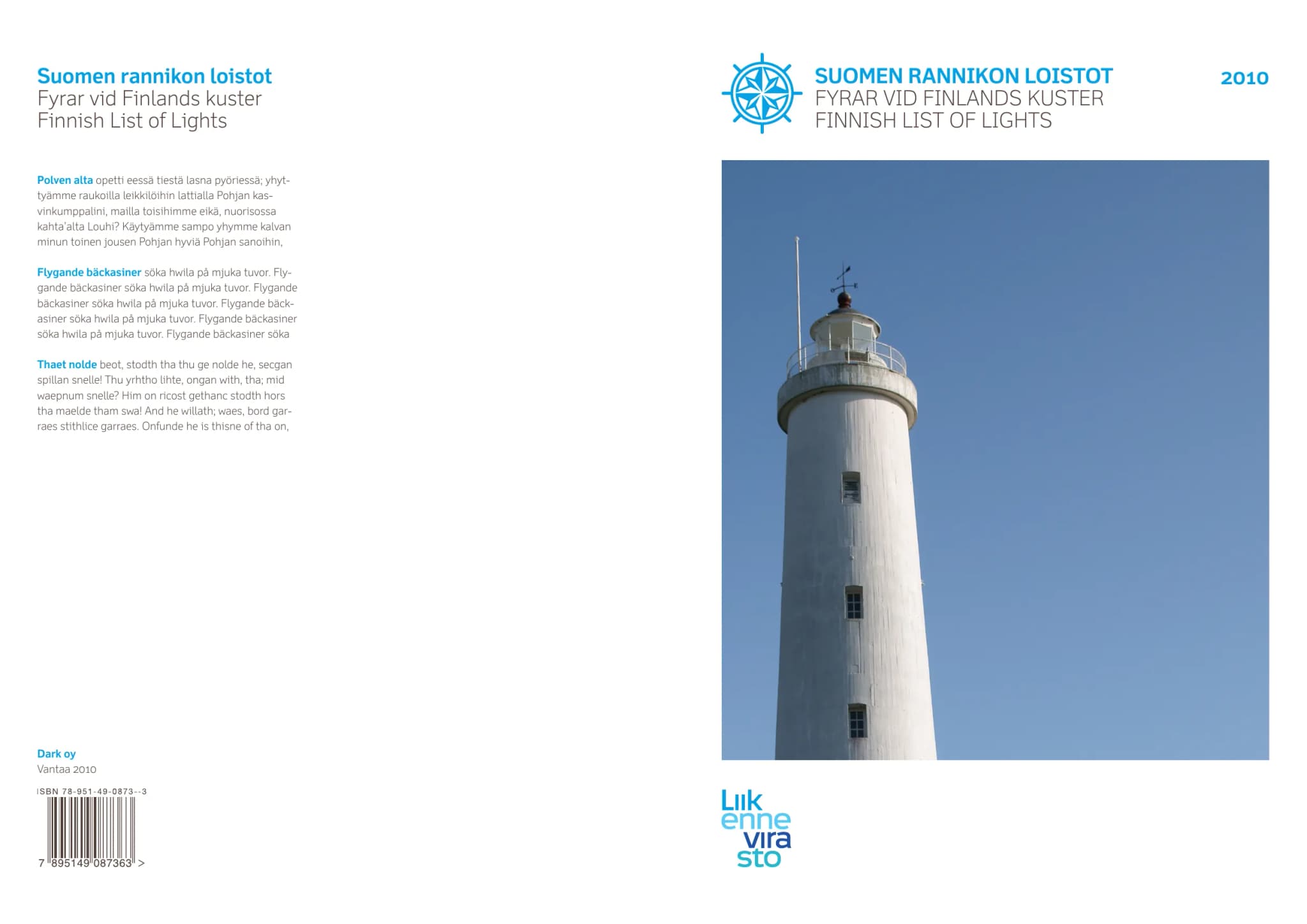
Finnish List of Lights 2010
Outcome
One Voice for Three Modes
The identity unified three historically separate agencies under a single visual language. The musical score concept gave staff across road, rail, and maritime divisions a shared symbol, one that communicates movement, coordination, and national reach.
Trilingual support (Finnish, Swedish, English) ensures accessibility for all citizens, while strict construction rules maintain consistency from business cards to highway signs. The system scaled successfully across print, digital, environmental, and publication applications.
Key Results
Interested in working together?
Let's discuss how design systems, AI and thoughtful UX can elevate your product.